Freelance UX/UI DesignerResponsive Marketing WebsiteRecycling / Circular Packaging

Aluminium Loop

Aluminium Loop · Mar 2026 – May 2026
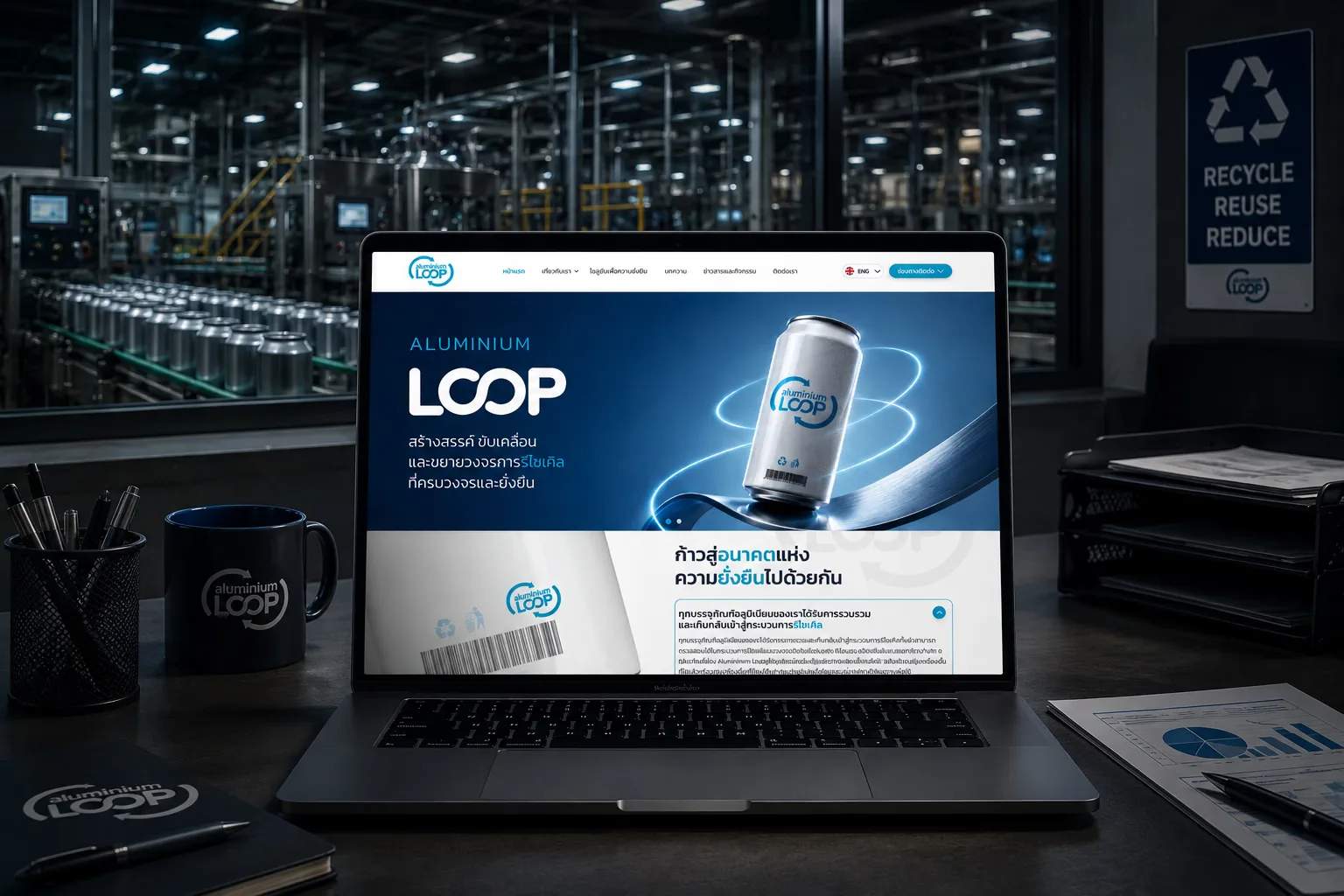
Aluminium Loop website redesign — heuristic audit of the live site and a rebuilt bilingual marketing surface
Executive Summary & Impact
Minimalism
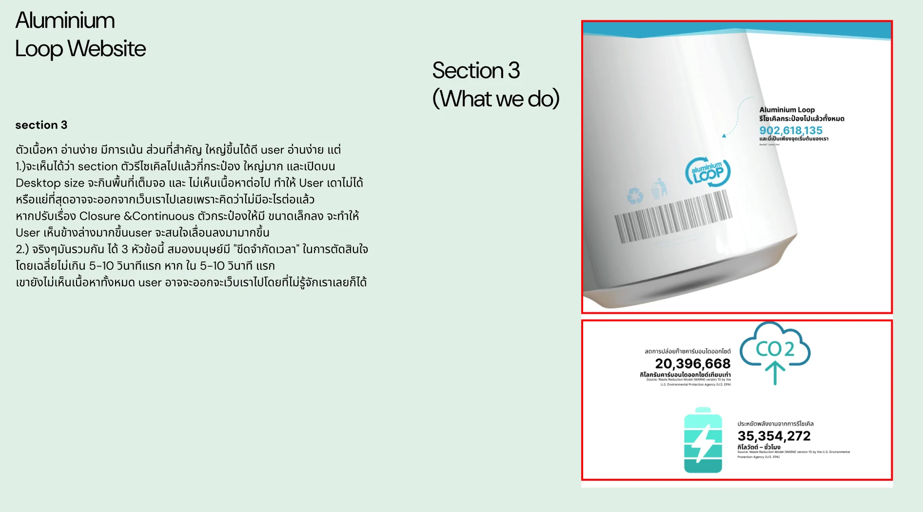
Aesthetic and minimalist design
full-screen counter reduced to a row so the page reads on
Consistency
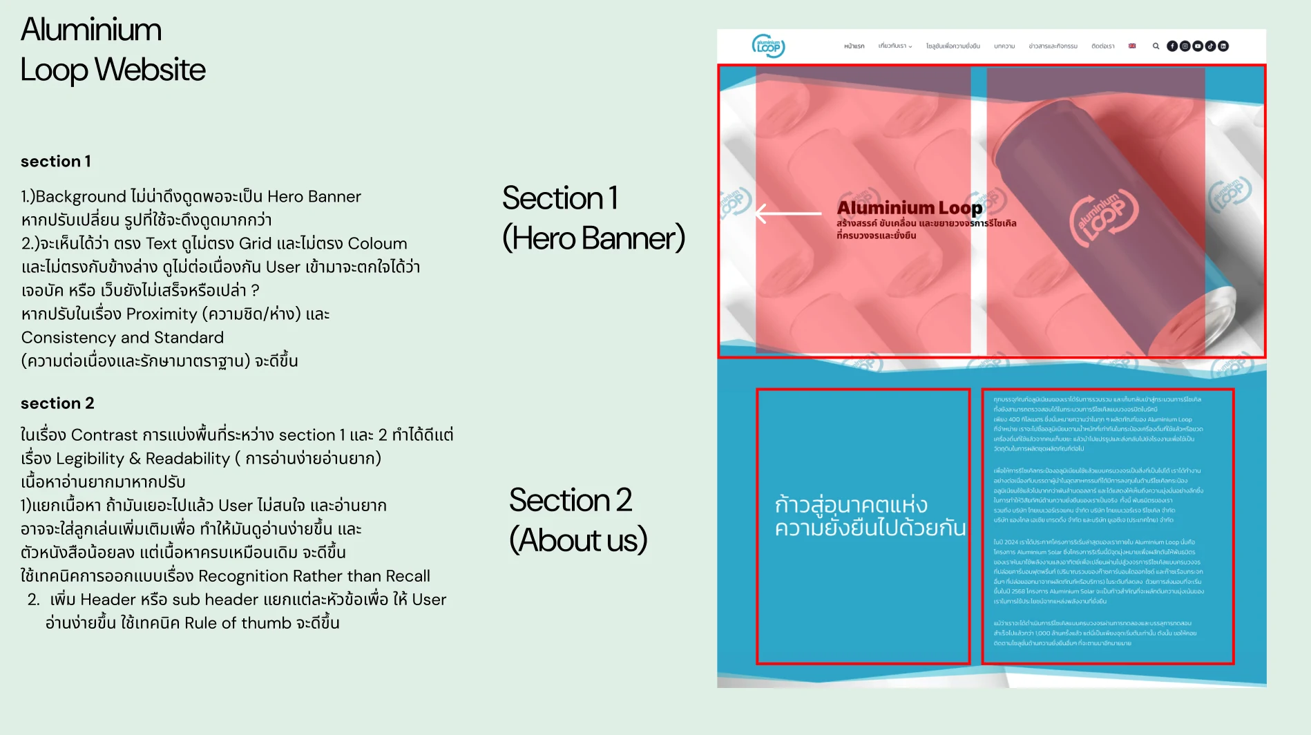
Consistency and standards
hero realigned to the grid the rest of the page follows
Recognition
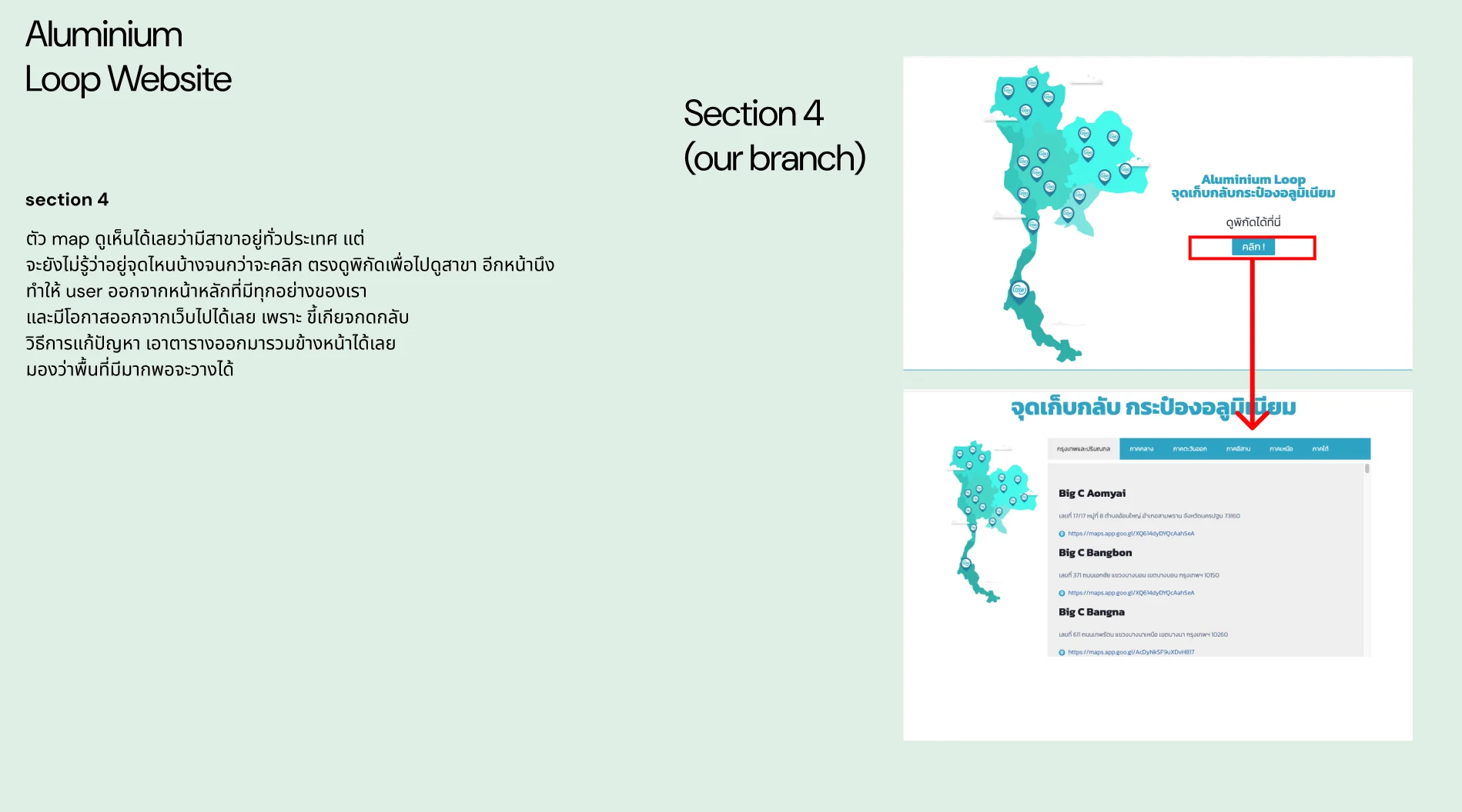
Recognition rather than recall
location table beside the map, not on another page

A redesign of a recycling company's marketing site that began as a heuristic audit of the live site. Each finding was written against a named principle so it could be argued rather than asserted, and the redesign rebuilt the site on what the audit found. Delivered as a complete design; not in production at the time of writing.

01 / Discovery & Heuristic Gaps

Problem & Usability Gaps

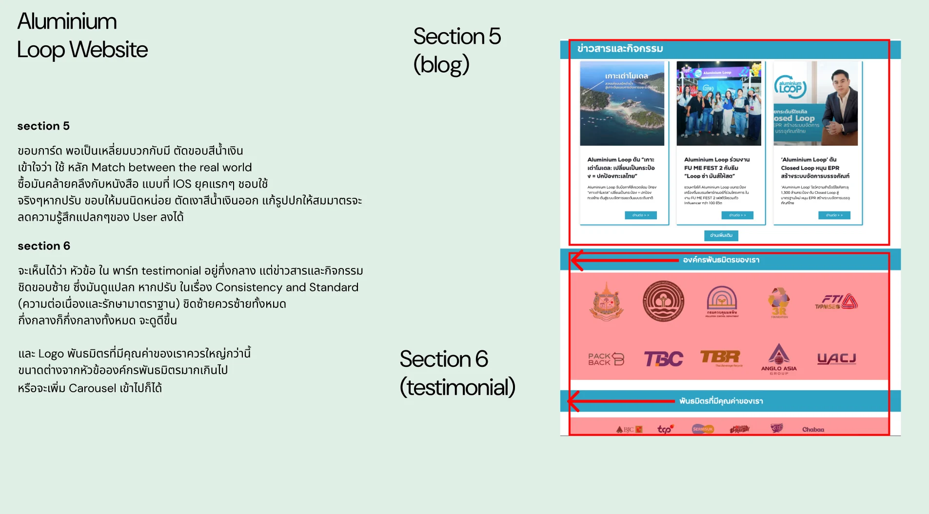
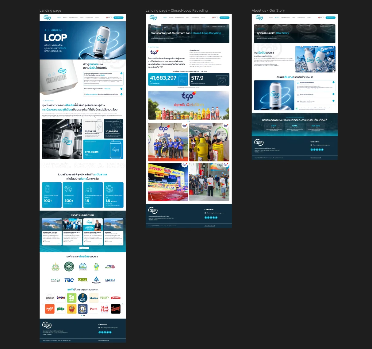
The site already carried strong content, but its layout worked against it. The audit found three main problems: a counter that filled the whole desktop viewport, so nothing below was visible and nothing suggested the page continued; a hero headline sitting off the grid the rest of the page used; and a branch map whose locations could only be read by leaving for a separate page. Smaller findings covered card styling and heading alignment that did not match the rest of the page.

Scroll barrier
a full-screen counter with no visible next section
Off-grid hero
headline block misaligned with the content beneath it
Lookup elsewhere
reading a location meant leaving the page for another
02 / Architecture & UX System

Design Decisions by Heuristic

01
Heuristic evaluation
Audit the Live Site Before Proposing Anything
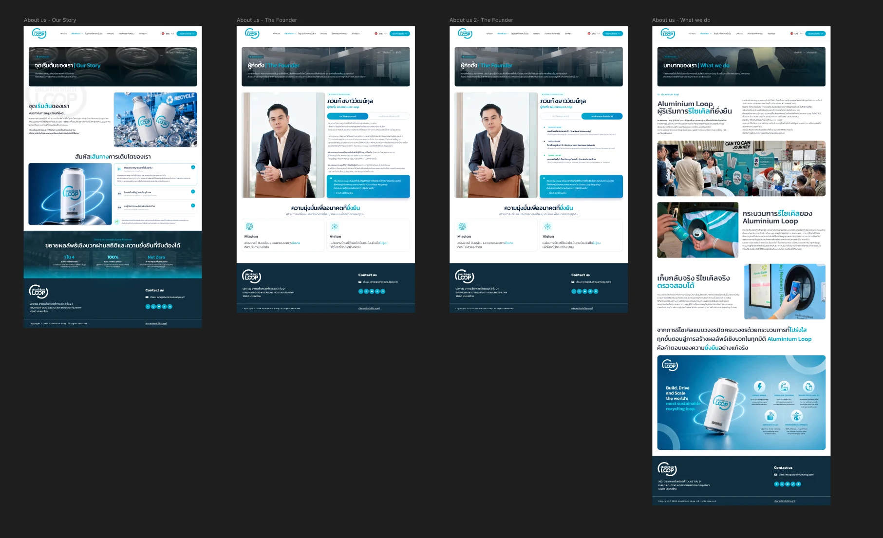
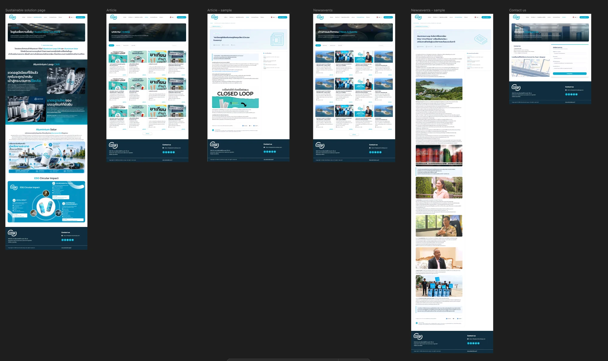
Six sections of the live site were reviewed against named principles, including proximity, consistency and standards, closure and continuity, real-world match and recognition over recall. Naming the principle turned each note from an opinion about polish into a specific fix the client could act on.
02
Aesthetic and minimalist design
Impact Figures Reduced to a Stat Row
The figures kept their prominence but lost the full-screen treatment, sitting as a compact row that lets the next section break the fold. A visitor can see there is more page below, so the content the audit found unreadable now gets read.
03
Consistency and standards
One Grid, One Alignment Rule
The hero headline was realigned to the grid the rest of the page follows, section headings were given one alignment rule, card corners and shadows were brought in line with the rest of the system, and partner logos were raised to the scale of the heading above them.
04
Recognition rather than recall
Location Table Beside the Map
The branch map gained its location table inline, using horizontal space that was already empty. A visitor reads the nearest drop-off point while the map is still in view, instead of leaving the page and carrying the location back in their head.
03 / Verification & Evidence

Before & After by Heuristic

HeuristicBeforeAfterChange
MinimalismFull-screen counterCompact stat row above the fold breakContinued
ConsistencyHero off the page gridAligned to the content gridAligned
RecognitionLocations on a separate pageTable inline beside the mapInlined
ConsistencyMixed heading alignment and card stylesOne alignment rule, one card styleUnified

"An audit that says a page looks unpolished can be dismissed. An audit that says the headline breaks the grid the rest of the page follows, and names the principle, is a fix."

— Design rationale · Aluminium Loop
04 / Retrospective

Design Learnings

→

Naming the principle behind a finding is what makes a critique actionable; without it, the client hears taste rather than a problem.

→

A number given the whole viewport reads as the end of the page, not as emphasis: scale bought attention here at the cost of everything below it.

→

A link that leaves the page is a real cost on a site with one main surface, because the visitor has to choose to come back.