Beurdev Agency

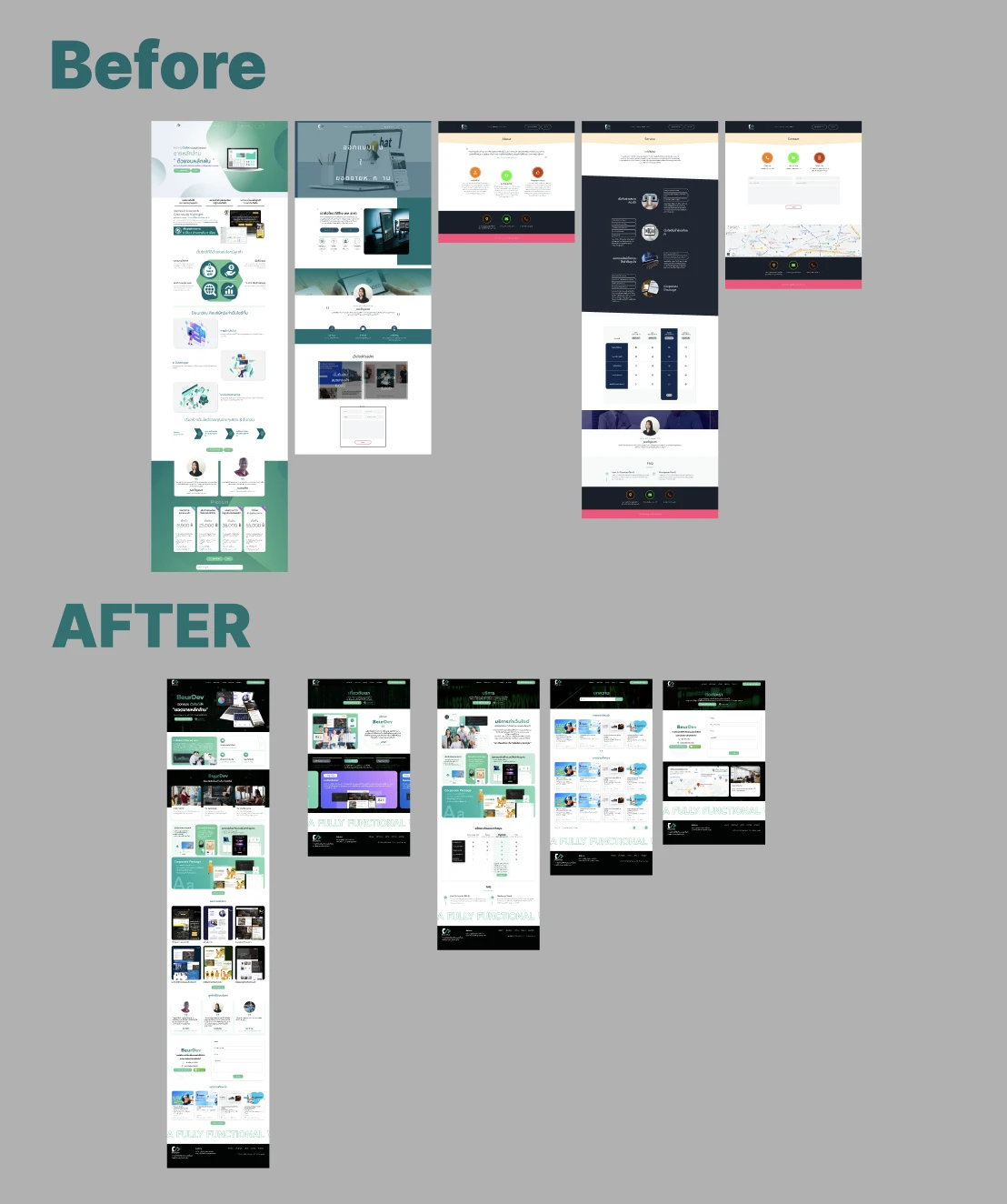

A rebuild of a software agency's own site, designed for a prospect deciding whether the team fits their project before getting in touch. The design gives five pages one visual language, names the frameworks behind each service, and labels the working process by stage. Each decision below is tied to the usability heuristic it serves.
Problem & Usability Gaps
The site being replaced had the right sections, a price list and a package table among them, but it did not read as one company. Read against the heuristics, its five pages used two unrelated looks, so a visitor moving between them could not be sure they were still on the same site; the team was described by role, with no frameworks named, so a technical buyer had to ask what the team builds in; and two of the pages were led by stock illustration that showed nothing of the work.
Design Decisions by Heuristic
Before & After by Heuristic
| Heuristic | Before | After | Change |
|---|---|---|---|
| Consistency | Teal pages and navy pages | One dark system on all five pages | Unified |
| Real-world | Team described by role | Frameworks named in three groups | Checkable |
| Visibility | Process as a row of arrows | Three stages, each with a status | Labelled |
| Minimalism | Stock illustration | Client work and founders' photos | Focused |
"A prospect choosing a software house runs two checks it can make on the page: is this one serious company, and does it build in what my project needs. The rebuild puts both answers where they can be checked."
— Design rationale · Beurdev AgencyDesign Learnings
Naming frameworks is stronger than describing capability because it is checkable; a claim a visitor can verify in their own vocabulary carries weight that a general one does not.
Consistency across pages is part of credibility: five pages in two looks read as a set of templates, not as one company.
For a technical service the visual register is part of the message; illustration that carried no information was quietly saying the wrong thing.