Lead UX/UI DesignerResponsive Marketing SiteElderly Care / Nursing Home

CWNH Website

BEURDEV CO., LTD. · Jun 2024 – Sep 2024
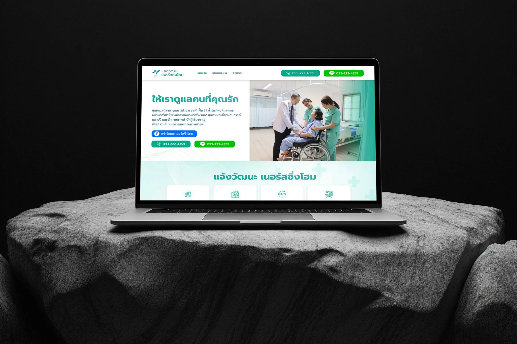
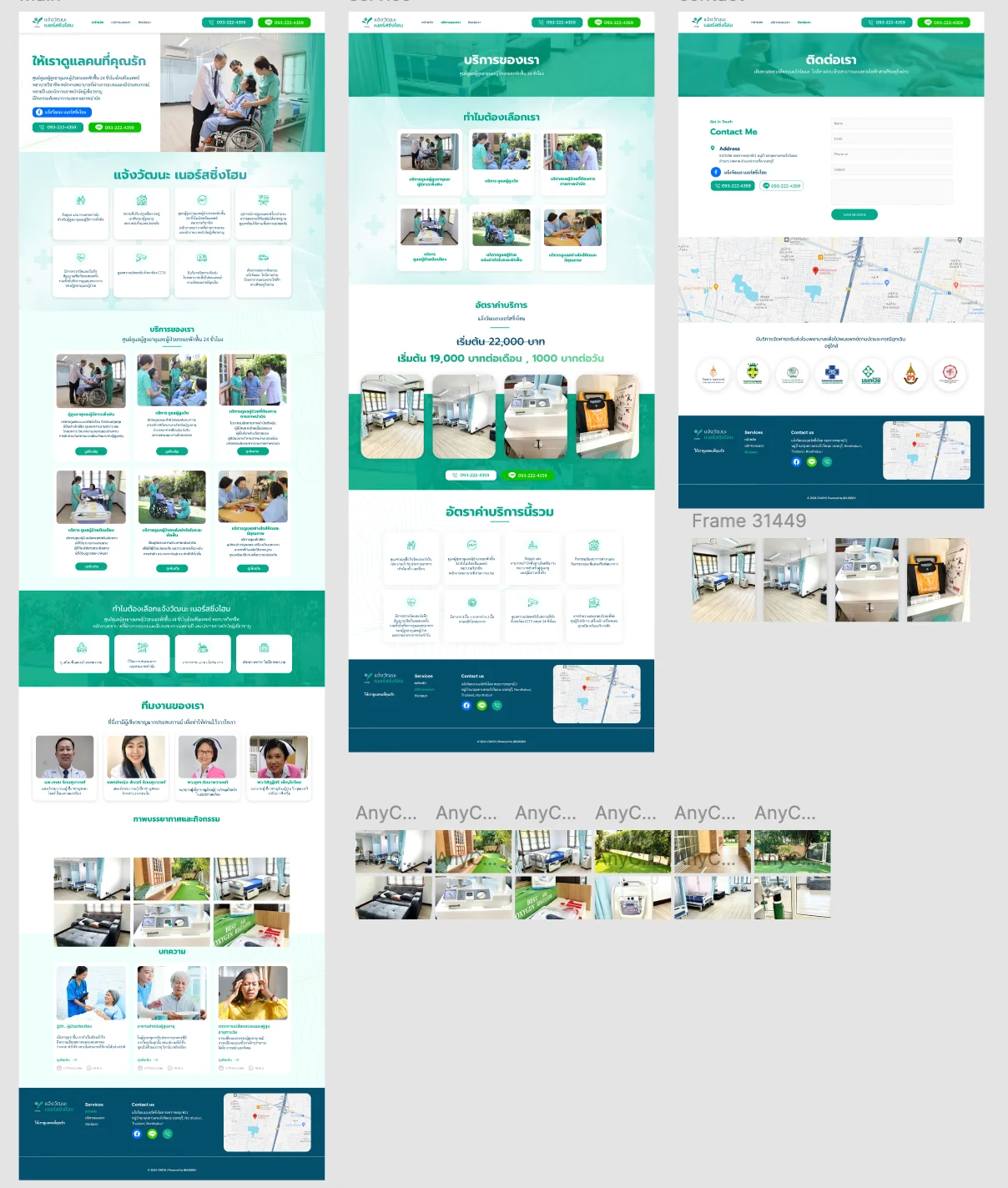
Chaeng Watthana Nursing Home website — named care team, published rate with inclusions, nearby transfer hospitals
Executive Summary & Impact
Prevention
Error prevention
rate published with what it covers, so nothing surprises
Real-world
Match between system and the real world
real people and rooms, so a visit confirms what was seen
Guidance
Help and documentation
emergency hospitals listed before a family has to ask

A site for a 24-hour elderly care centre, designed for an adult child deciding where to place a parent. The decision is made on trust, so the design shows the real people and rooms, states what the rate covers, and answers the question families find hardest to ask.

01 / Discovery & Heuristic Gaps

Problem & Usability Gaps

A family choosing a nursing home is deciding who will care for their parent every day. Read against the heuristics, care sites typically leave out the cues that settle it: who the staff are, what the rooms really look like, what the rate includes, and what happens in an emergency. Each gap leaves the family to find out on a visit or a call, or to assume.

Unseen staff
care team not introduced before a visit
No real view
rooms and equipment not shown as they are
Rate unexplained
what a monthly rate covers left unstated
02 / Architecture & UX System

Design Decisions by Heuristic

01
Match between system and the real world
Real People and Real Rooms
Two doctors and two nurses appear by name with photographs and a line on their experience, followed by real photographs of rooms, beds and daily activities from a dedicated set. A family sees the people and the conditions they are choosing, so a visit confirms what they already saw rather than revealing it.
02
Error prevention
The Rate and Everything It Covers
The service page states the monthly and daily rate, and directly beneath it an eight-item block lists what that includes, from three meals and two snacks a day to vital-signs monitoring and round-the-clock CCTV. A family knows what they are paying for before they call, rather than bracing for it.
03
Help and documentation
Nearby Hospitals Named
The contact page lists seven nearby hospitals beside the map as the transfer destinations in an emergency. The question families find hardest to ask on a first call is answered without them asking.
04
Flexibility and efficiency of use
Call or LINE From Any Page
The phone number and a LINE button sit in the header of every page and again beneath the rate, so a family that has read enough can call or message from wherever they stopped, instead of looking for the contact page.
03 / Verification & Evidence

Before & After by Heuristic

HeuristicBeforeAfterChange
Real-worldStaff and rooms not shownNamed team and real photographyShown
PreventionRate unexplainedRate with an eight-item inclusions listClear
GuidanceEmergency plan unaddressedSeven nearby hospitals namedAnswered
EfficiencyContact on its own pagePhone and LINE in every headerCloser

"The question a family cannot bring themselves to ask on a first call is what happens at three in the morning. Naming the hospitals a resident would go to answers it before they have to."

— Design rationale · CWNH Website
04 / Retrospective

Design Learnings

→

In care, photography is evidence rather than atmosphere: a visit should confirm what the family already saw.

→

Stating what a price includes prevents a misunderstanding a family would otherwise only discover after deciding.

→

The fear behind this kind of decision is usually unspoken, and answering it unprompted is the most useful help a page can give.