Senior UX/UI DesignerResponsive Marketing & Catalogue SiteCorporate Training
Happy Training Website
HAPPY THREE CREATION CO., LTD. · Aug 2023 – Feb 2024
Design Process & Workflow
From Wall of Links to Catalogue
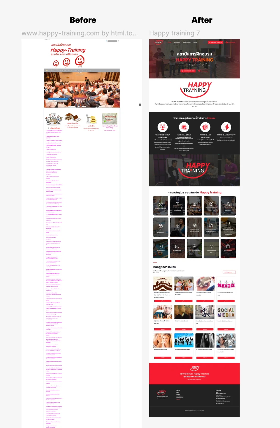
The single column of course links being replaced, set beside the grouped, image-led catalogue.
Step 01
Before and After: From a Wall of Links to a Catalogue
The earlier site listed every course as a plain red text link in one long column, with no grouping and no images, so a buyer had to read the whole list to learn whether a course existed. The redesign states the delivery formats before any course, then shows the course groups as an image grid, and only then the course cards with a category filter above them. Recognising a group by its image and narrowing with the filter replaces reading and remembering a list.
Executive Summary & Impact
Minimalism
Aesthetic and minimalist design
a flat column of links regrouped into categories
Recognition
Recognition rather than recall
image cards and a filter, so the catalogue is scanned
Real-world
Match between system and the real world
delivery format stated before the course list
A redesign of a corporate training institute's site, whose catalogue had been a single long column of plain text links. The design groups the catalogue, gives the eye something to scan by, and states how sessions run before the course list. Each decision below is tied to the usability heuristic it serves.
01 / Discovery & Heuristic Gaps
Problem & Usability Gaps
The previous site listed every course as a plain text link in one unbroken column, dozens of them, with no grouping and no imagery in the list. Read against the heuristics, a buyer looking for one course had to read the entire list to learn whether it existed, with nothing to recognise by and no structure to narrow the search; and how a session would run, which a corporate buyer decides alongside the topic, was not stated at all.
One flat column
every course as an undifferentiated text link
No grouping
nothing organising courses by skill type or function
No imagery
no visual hierarchy in the list; it had to be read
02 / Architecture & UX System
Design Decisions by Heuristic
01
Aesthetic and minimalist design
Fifteen Groups Instead of One List
The catalogue was restructured into fifteen groups, from coaching and leadership to digital skills and online courses. A visitor sees fifteen choices instead of the whole list and navigates by the skill they need rather than by scanning titles.
02
Recognition rather than recall
Cards and a Filter Instead of Links
Courses became image cards with a category filter above them. Imagery and grouping give the eye something to recognise, so the catalogue is scanned rather than read.
03
Match between system and the real world
Delivery Format Before the Syllabus
Four formats are stated before any course is shown: training with group coaching, hard-skill workshop, training with workshop, and training with activity. A corporate buyer decides how a day will run with their team as deliberately as what it covers, so the format comes first.
04
Consistency and standards
One Card for Every Course
Every course card takes the same shape: a photograph, the numbered course title and a red details button in the same place. Once a buyer has read one card, the rest of the grid can be compared at a glance.
03 / Verification & Evidence
Before & After by Heuristic
Heuristic
Before
After
Change
Minimalism
One flat column of links
Fifteen grouped categories
Restructured
Recognition
Read the entire list
Image cards with a category filter
Scannable
Real-world
Format not stated
Four formats before the catalogue
Defined
Consistency
Links of varying length
One card shape for every course
Uniform
"Dozens of courses in one column is not a catalogue, it is a wall. The institute's depth was its best asset and its worst navigation problem, and grouping it was the redesign."
— Design rationale · Happy Training Website
04 / Retrospective
Design Learnings
→
Depth becomes a liability the moment it is presented flat; the minimalist fix is grouping rather than trimming.
→
In a long list, imagery is not decoration: it gives recognition something to work with, which is the difference between reading a page and finding something on it.
→
Buyers decide format as deliberately as topic, so the format belongs before the list rather than inside each course page.