Once Accounting Website

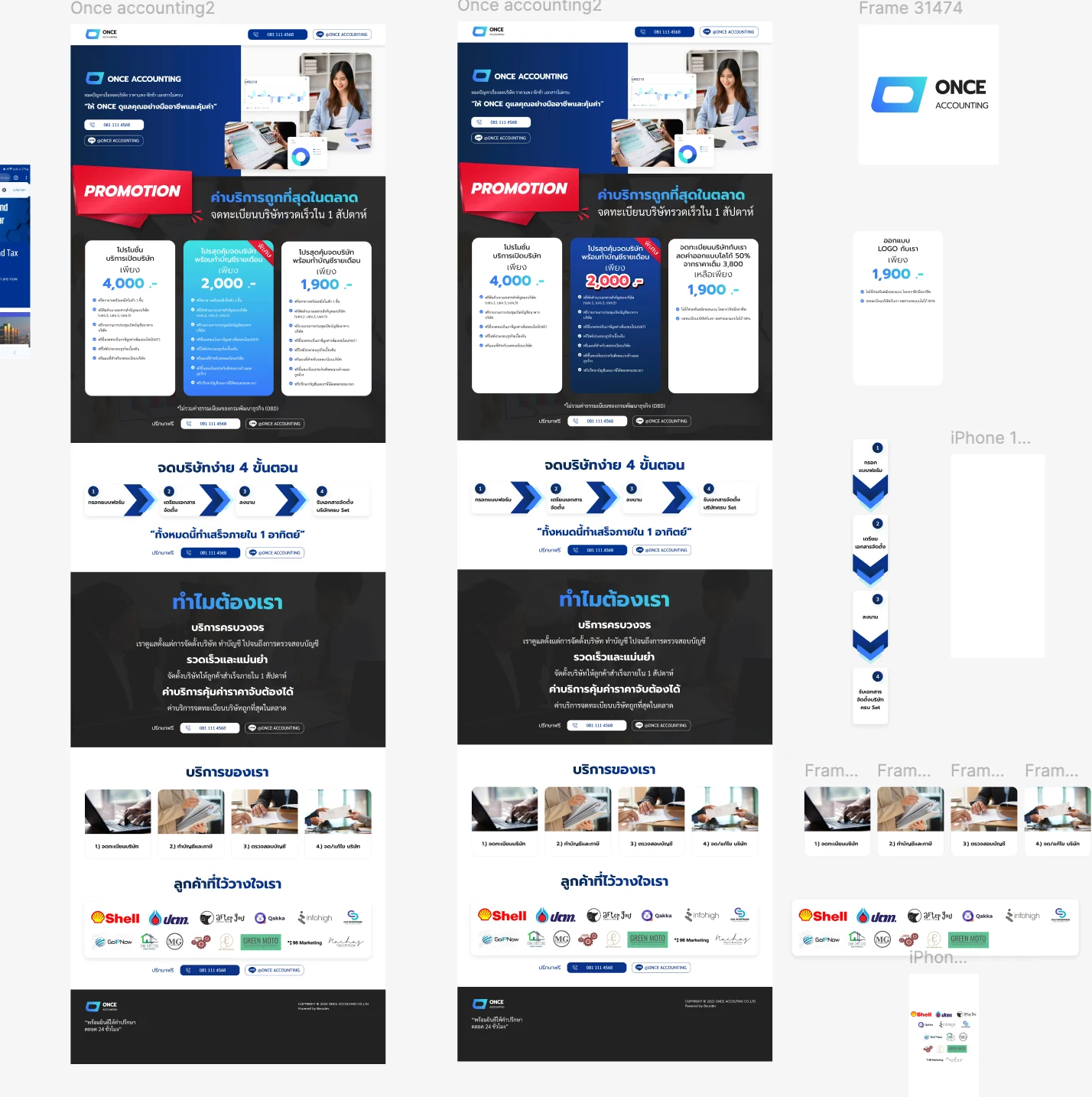
A single sale page for an accounting firm's company registration service, built as the landing page for paid advertising. The design answers an impatient visitor's two questions, what it costs and how long it takes, in the first screens, and keeps the next step beside wherever they stop reading.
Problem & Usability Gaps
A visitor arriving from an advertisement has two questions and little patience: what it costs and how long it takes. Read against the heuristics, a corporate site answers neither where they land; a quoted price that later grows by government fees misleads them; and a single contact form at the end of the page asks them to scroll to the bottom at the moment they decide.
Design Decisions by Heuristic
Before & After by Heuristic
| Heuristic | Before | After | Change |
|---|---|---|---|
| Visibility | Process unstated | Four steps and a completion time | Shown |
| Prevention | Price on request | Three tiers, excluded fees disclosed | Honest |
| Efficiency | Footer form only | Contact after every block | Multiplied |
| Consistency | Steps laid out for a wide screen | Same numbered order, stacked on a phone | Kept |
"Ad traffic is expensive and impatient. If the first screens do not show the price and the timeline, the click has already been paid for nothing."
— Design rationale · Once Accounting WebsiteDesign Learnings
On a paid-traffic page, visibility means the price and the timeline in the first screens; anything placed later asks an impatient visitor to keep reading first.
Disclosing what a price excludes is error prevention for the visitor and protects the number's credibility at the same time.
Designing the offer block twice forced the third card's job to be decided explicitly, in a way that arguing about it in the abstract would not have.