Orgeness Orange Juice Website
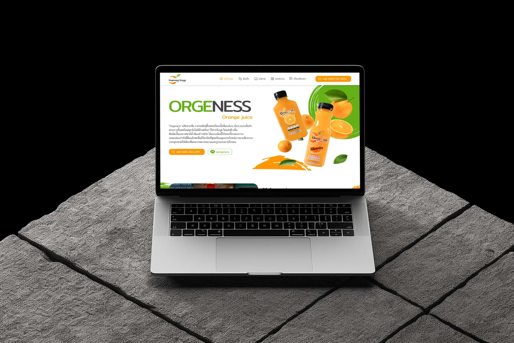
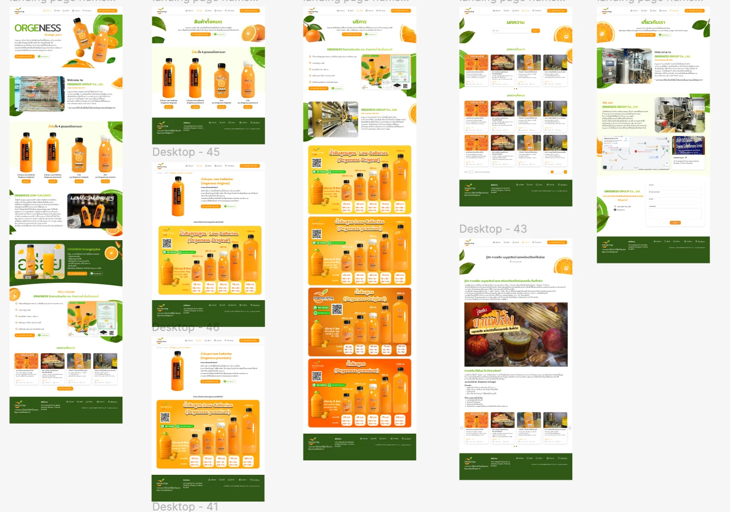
A product and wholesale site for a juice manufacturer, designed for a reseller deciding whether to stock a line rather than a shopper buying a bottle. The design keeps the numbers a reseller needs in view, matches the pages to how resellers actually stock, and gives contract production its own route.
Problem & Usability Gaps
The business sells wholesale and produces juice for other companies, but a conventional product site is shaped for someone buying one bottle. Read against the heuristics, that shape fails a reseller in three places: the margin, their first question, can only be answered by asking for prices; a variant selector assumes the buyer compares the range when they stock a single line; and a production offer with no page of its own is either missed or crowds the catalogue.
Design Decisions by Heuristic
Before & After by Heuristic
| Heuristic | Before | After | Change |
|---|---|---|---|
| Recognition | Prices on request | Retail price and two breaks per size | In view |
| Real-world | Variants of one product | Four products, a page each | Separated |
| Minimalism | Production offer with no place | Summary at home, detail on its own page | Placed |
| Efficiency | Contact apart from pricing | LINE QR and phone on the price panel | Adjacent |
"A reseller's first question is margin. Every decision here keeps the answer in view and the next step beside it, so the arithmetic and the order happen on the same page."
— Design rationale · Orgeness Orange Juice WebsiteDesign Learnings
Putting the numbers a buyer needs where they decide removes a round trip that a contact form can only add.
Page structure should follow the user's real unit of decision; a variant selector suits someone comparing a range, not someone stocking one line.
A secondary offer needs a place of its own, or it either disappears or crowds out the primary one.