Senior UX/UI DesignerResponsive Marketing WebsiteAviation Training / Vocational Education

PATC Website

BEURDEV CO., LTD. · Apr 2024 – Jun 2024
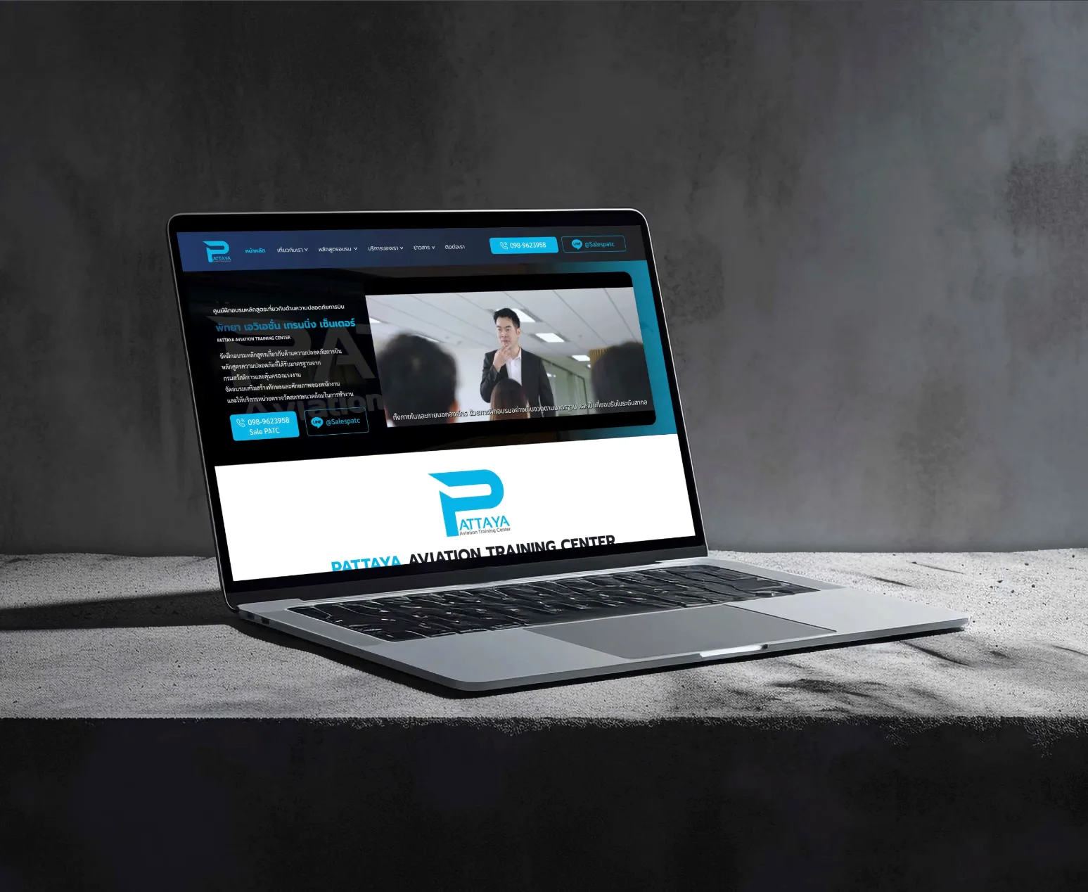
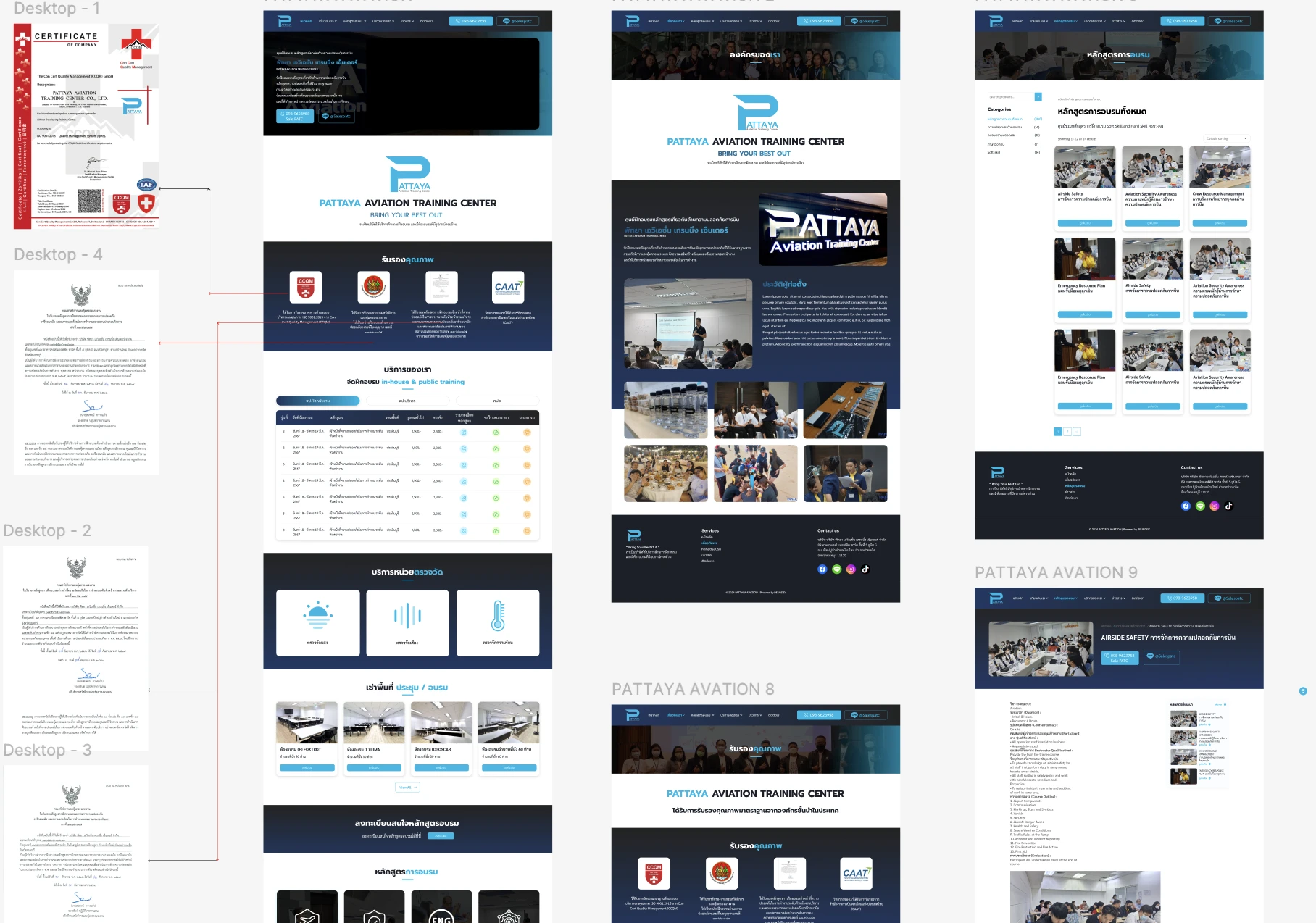
Pattaya Aviation Training Center website — accreditation marks, course catalogue and public training schedule
Executive Summary & Impact
Consistency
Consistency and standards
one detail template so any two courses compare field by field
Recognition
Recognition rather than recall
schedule row answers date, area, price and booking in one place
Minimalism
Aesthetic and minimalist design
competing service lines given a fixed order down the homepage

A course and booking site for an aviation and occupational safety training centre, designed around the three questions a visitor brings: is this centre qualified to train me, which of its services is mine, and can I compare and book a course without phoning. Each decision below is tied to the usability heuristic it serves.

01 / Discovery & Heuristic Gaps

Problem & Usability Gaps

The material the site started from answered those questions in the wrong places. The centre's accreditation existed as four scanned documents, a certificate and three official letters, none of them where a visitor decides. The business runs three unrelated services that would otherwise compete for the top of one homepage. And a catalogue of courses is only useful if two of them can be compared, which turns into a memory task when each course page takes its own shape. Read against the heuristics, those were the three gaps to close.

Proof on paper
accreditation held as four scanned documents, away from the pages that need it
Three services
training, measurement and room hire sharing one homepage
Courses to compare
a catalogue whose value depends on comparing courses field by field
02 / Architecture & UX System

Design Decisions by Heuristic

01
Match between system and the real world
Trust Marks Drawn From the Certificates
Each accreditation mark was traced back to the document that issues it before it was drawn, so the mark a visitor sees on the site is the same one printed on the paper. Working from the documents rather than from a list of claims also kept the row to what the centre can actually evidence.
02
Aesthetic and minimalist design
One Block per Service, in a Fixed Order
Training, measurement services and room hire each get their own homepage block under their own heading, in an order that does not change. A visitor finds the one they came for by its heading instead of reading past the other two to work out which is which.
03
Recognition rather than recall
A Schedule Row That Holds the Whole Decision
The public schedule, grouped under tabs by course type, puts each run's number, dates, course and area on one row with the general and member prices, the course details, a quotation request and the booking action. Everything needed to book is in view at the moment of booking, so nothing has to be carried over from another page.
04
Consistency and standards
One Template for Every Course
Every course page uses the same fields in the same order: duration, course format, participants, instructor qualification, objectives, outline and evaluation. Because each field sits in the same place every time, two courses can be compared without relearning the page.
03 / Verification & Evidence

Before & After by Heuristic

HeuristicBeforeAfterChange
Real-worldFour scanned documentsMarks traced to the issuing documentsEvidenced
MinimalismThree services, one homepageOne block each, in a fixed orderSeparated
RecognitionDate, area, price and booking to findAll in one schedule row, with a quote requestIn view
ConsistencyCourses compared one page at a timeOne template across every courseStandardised

"Every page here answers one question a visitor brings: is this centre qualified, which service is mine, and can I compare and book without phoning. The heuristics were the test of whether each page actually answered it."

— Design rationale · PATC Website
04 / Retrospective

Design Learnings

→

Trust is a real-world match problem: a mark is only credible if it is the one printed on the document, so the trust row was built from the certificates rather than from claims.

→

When one organisation runs several services, minimalist design is mostly a question of order; fixing the order removes the sorting the visitor would otherwise have to do.

→

A course catalogue is used for comparison before it is used for reading, so consistency between course pages mattered more than the polish of any single page.