UX/UI DesignerResponsive Marketing & Portfolio SiteAmulet & Buddhist Object Manufacturing

Supakit Amulet Website
BEURDEV CO., LTD. · Jan 2024 – Mar 2024
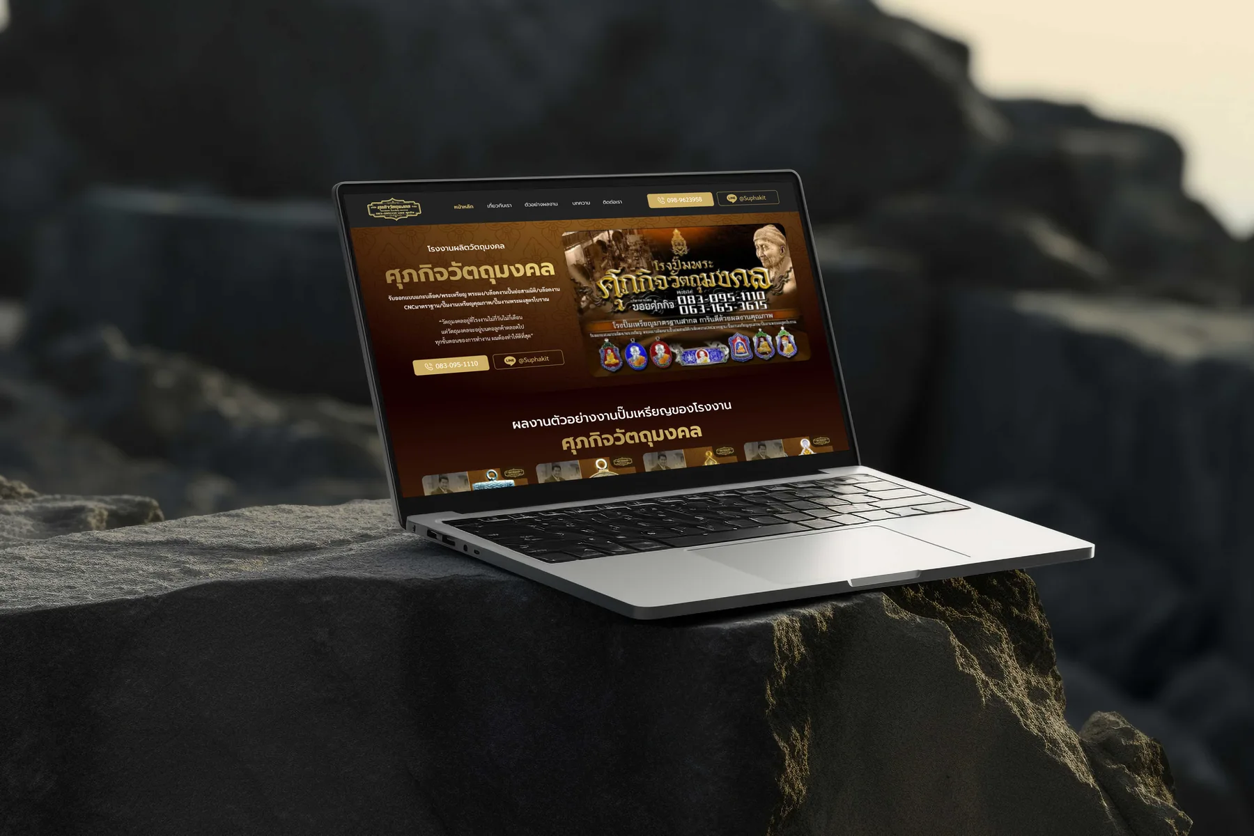
Supakit Watthumongkol website — die-struck and 3D sculpted portfolio, workshop photography and founder-fronted enquiry
Executive Summary & Impact
Minimalism
Aesthetic and minimalist design
work shot on black so relief and finish carry the image
Real-world
Match between system and the real world
the workshop and the founder shown, as on a visit
Efficiency
Flexibility and efficiency of use
contact one element away from any piece being viewed

A portfolio and enquiry site for a foundry making religious coins, medals and sculpted pieces, where a commission is a trust decision made on craftsmanship and on the person taking the order. The design lets the work carry the page, shows how it is made, and keeps the person and the contact within reach.

01 / Discovery & Heuristic Gaps

Problem & Usability Gaps

A client commissioning a sacred object judges two things: whether the finish is good enough and whether the person taking the order can be relied on, and in person they would judge both at the workshop. Read against the heuristics, a site has to give them the real-world cues they would use on a visit, finished work they can inspect, the production floor and the person they would deal with, and keep the route to asking a question short.

Finish unseen
without photographs, the work can only be judged in person
Process unseen
how a piece is struck and finished visible only on a visit
No named contact
a company name does not say who will take the order
02 / Architecture & UX System

Design Decisions by Heuristic

01
Aesthetic and minimalist design
Every Piece Shot on Black
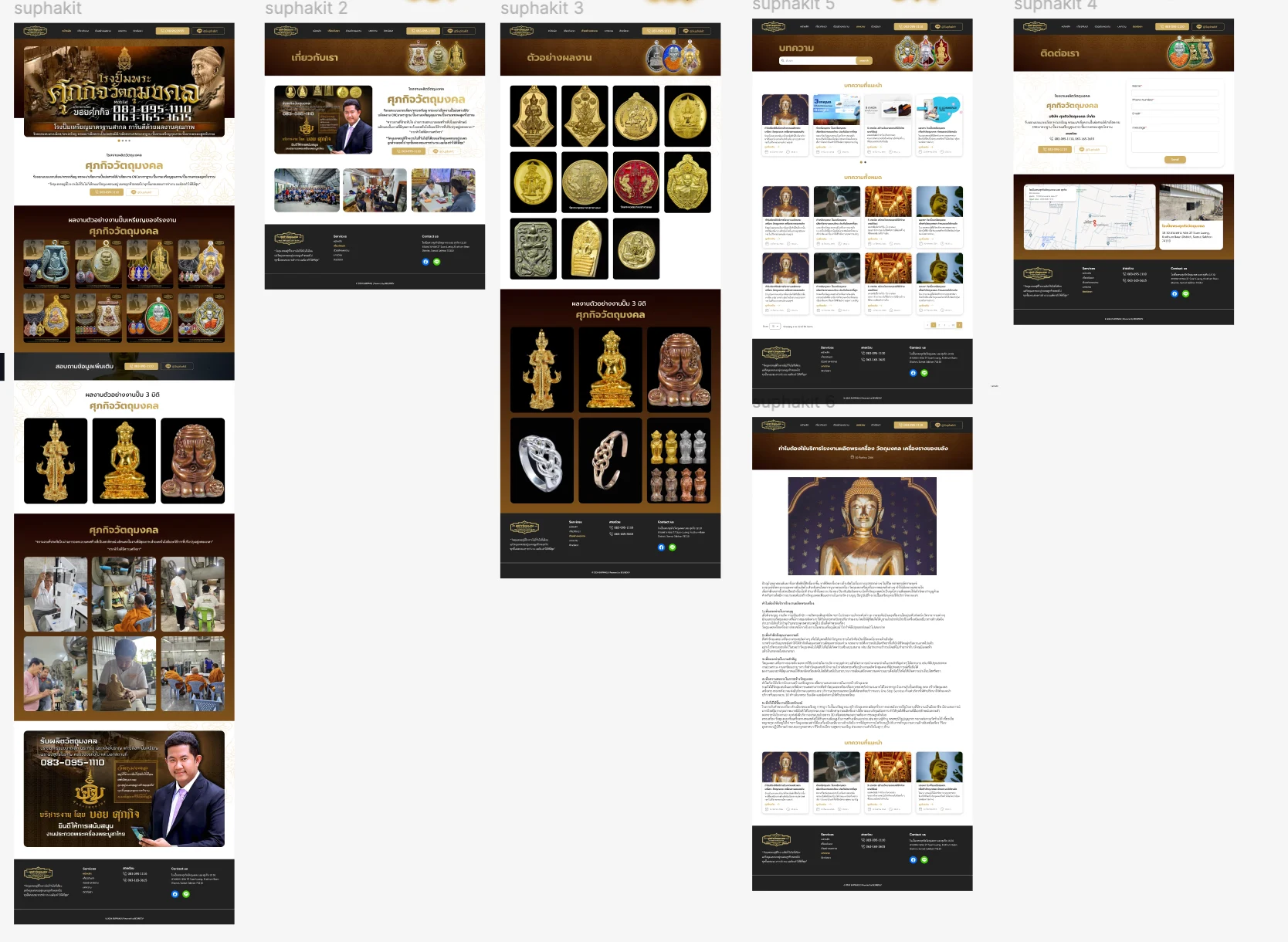
The portfolio expands two bodies of work, die-struck coins and medals and sculpted pieces, into grids where every item sits on black. Nothing competes with the relief, metal and finish, which are the only things a client is judging from the photograph.
02
Match between system and the real world
The Workshop and the Person, Shown
Six photographs of the production floor show the striking presses, inspection and hand sculpting, with monks visiting the work, and the founder appears by name, photograph and direct number on the homepage call to action. A client gets the cues they would look for on a visit: how the work is made and who they would deal with.
03
Consistency and standards
The Same Two Groups Everywhere
The homepage and the portfolio use the same two groups of work in the same order, so a category seen on the homepage is found in the same place in the full portfolio.
04
Flexibility and efficiency of use
Contact Never More Than One Element Away
Phone and LINE buttons sit in the header of every page and repeat at each section break, beside a contact page with a form and a map. A client can ask about a piece from wherever they are looking at it.
03 / Verification & Evidence

Before & After by Heuristic

HeuristicBeforeAfterChange
MinimalismWork judged only in personTwo groups of work, shot on blackPublished
Real-worldWorkshop visit needed to judgeProduction floor and founder on the siteShown
ConsistencyWork to sort throughSame two groups in the same orderPredictable
EfficiencyA visit or a phone callPhone and LINE in every headerCloser

"A client is not choosing a supplier; they are choosing someone to entrust a sacred object to. The site gives them the cues a workshop visit would: the work, the floor and the person."

— Design rationale · Supakit Amulet Website
04 / Retrospective

Design Learnings

→

Shooting metalwork on black is functional minimalism: the client is judging relief and finish, and any background competes with the only evidence they have.

→

Where a purchase is entrusted rather than transacted, the real-world cue is a named person, and it does more than any amount of company copy.

→

Keeping contact one element away from every piece shortens the step between looking and asking, which is where interest is easiest to lose.