TH Health Platform

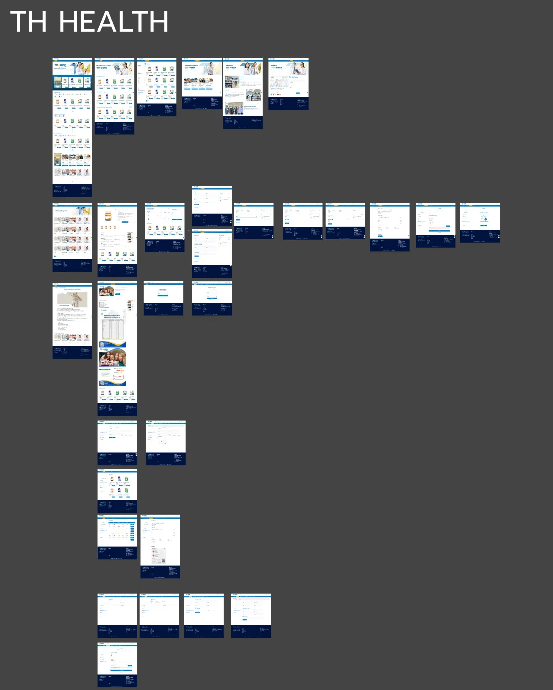
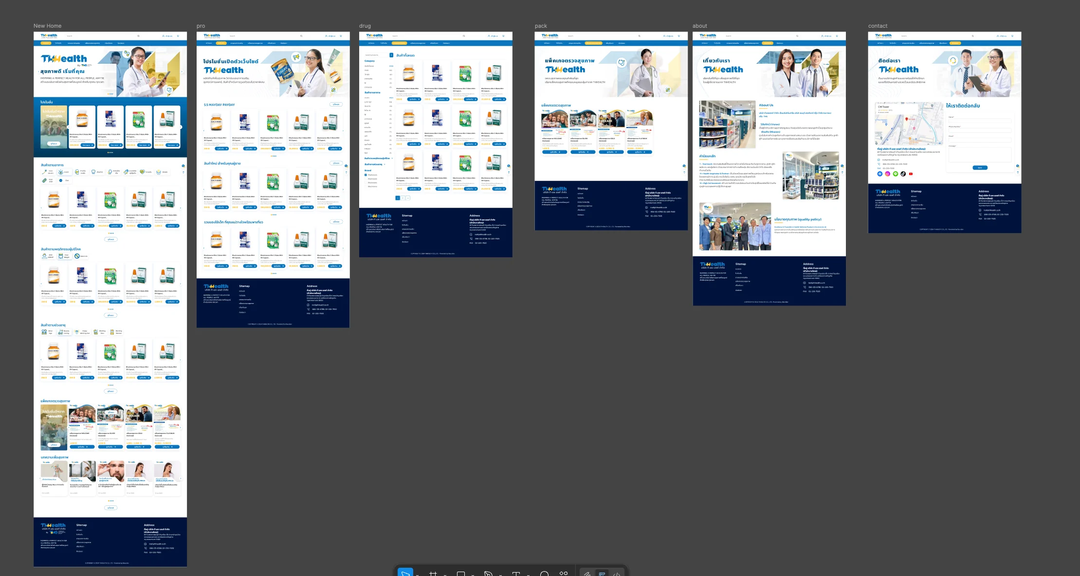
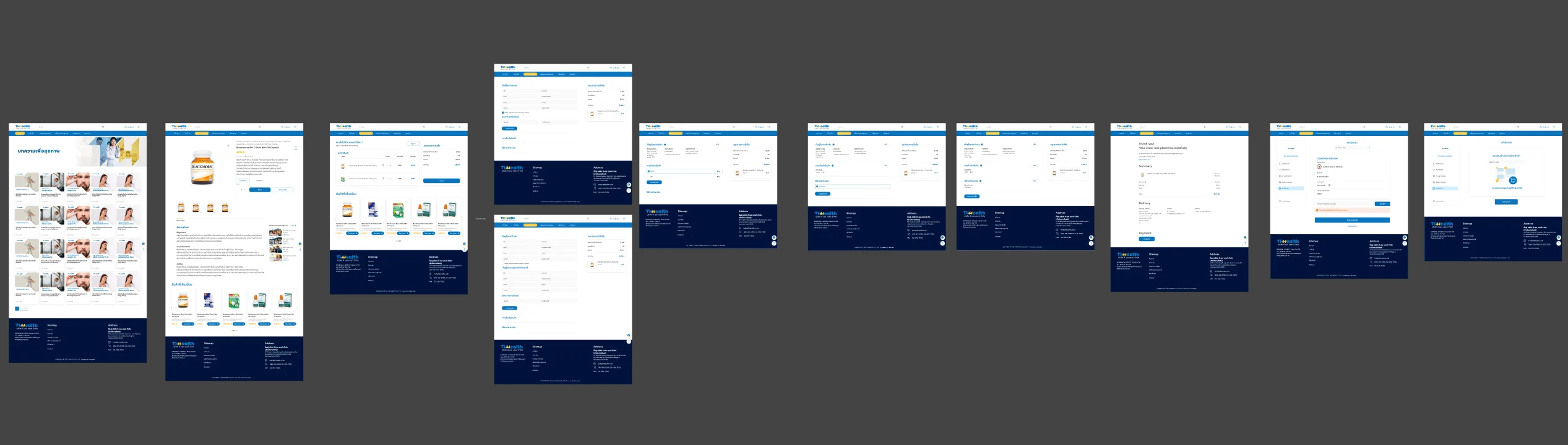
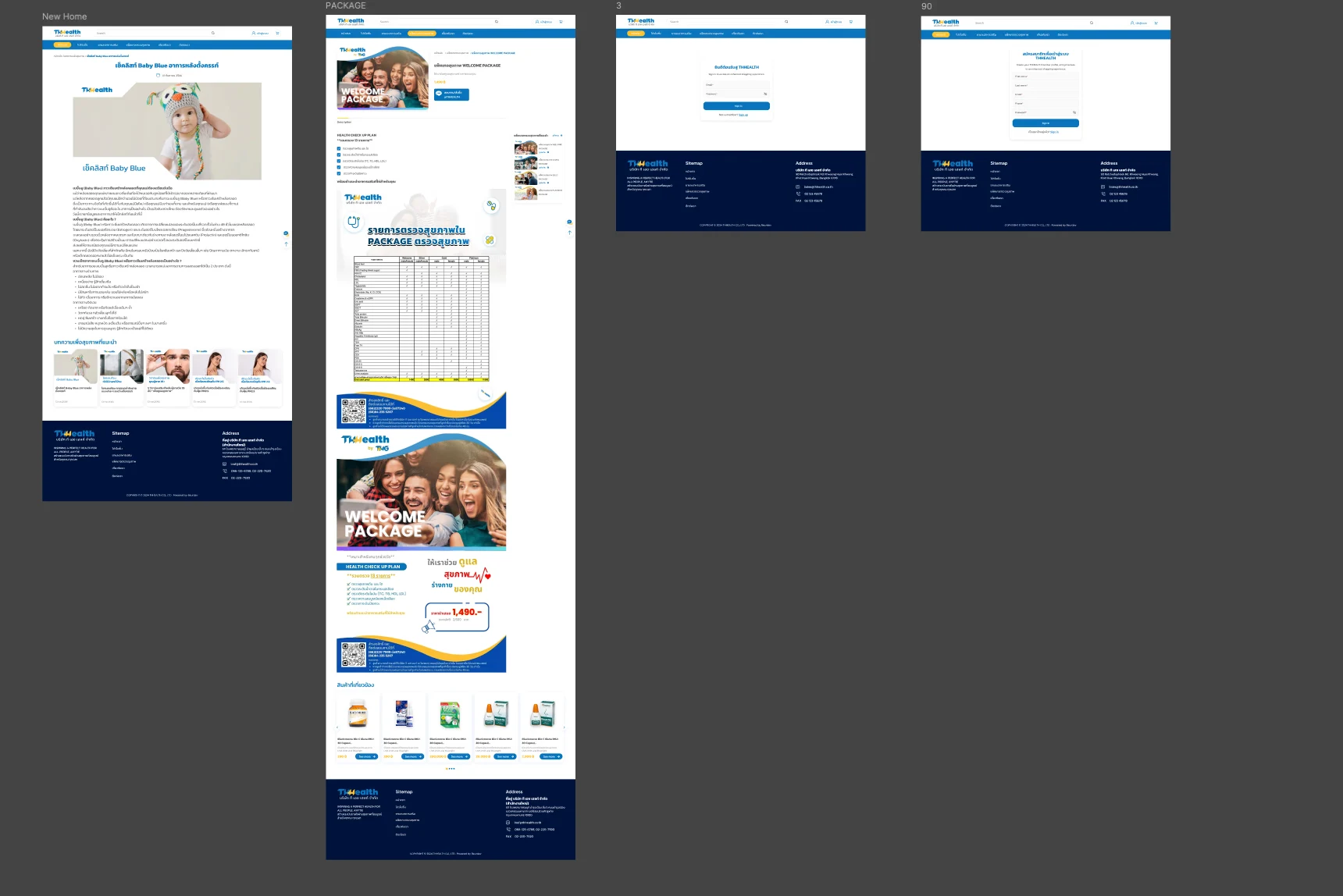
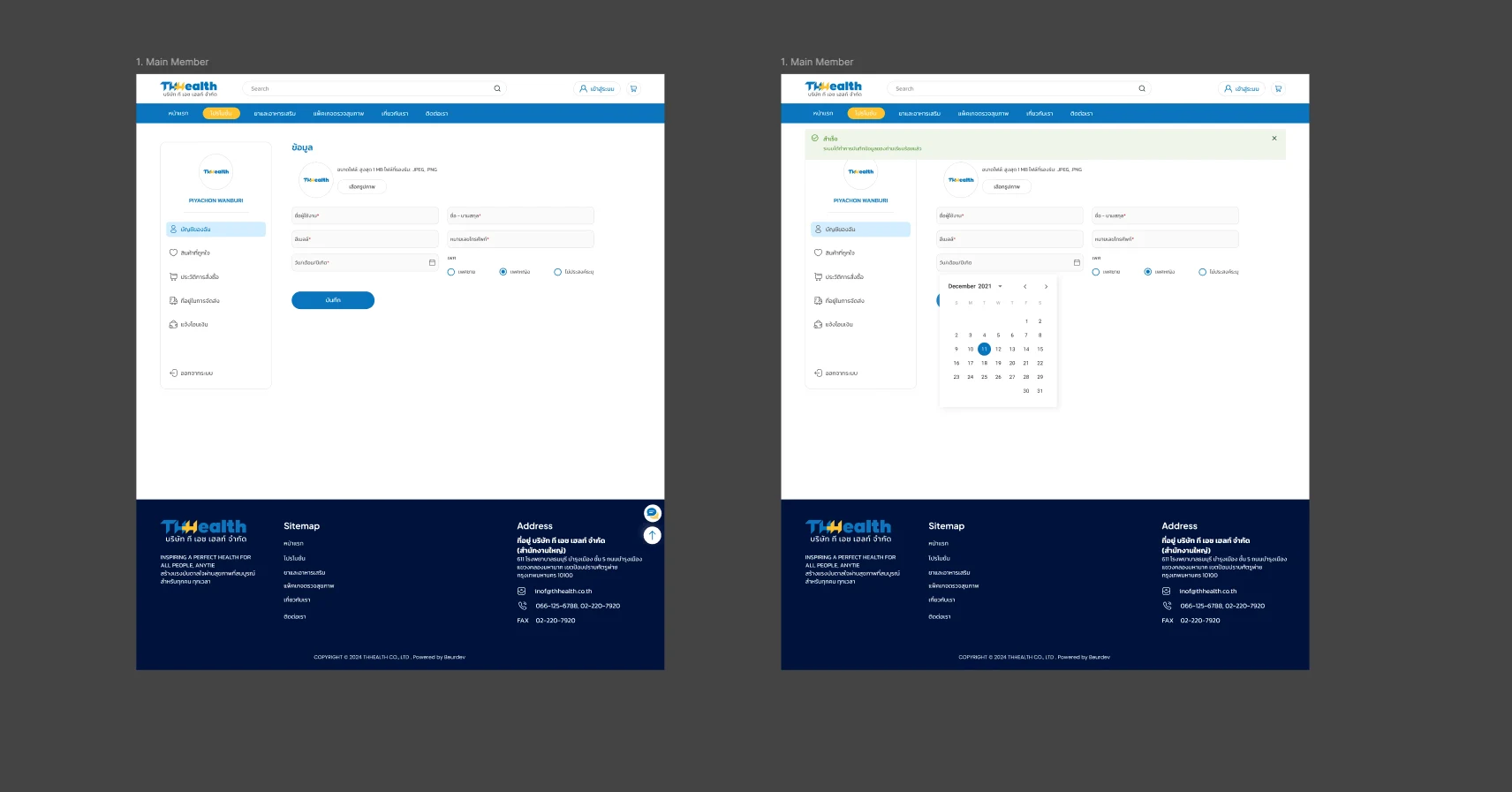
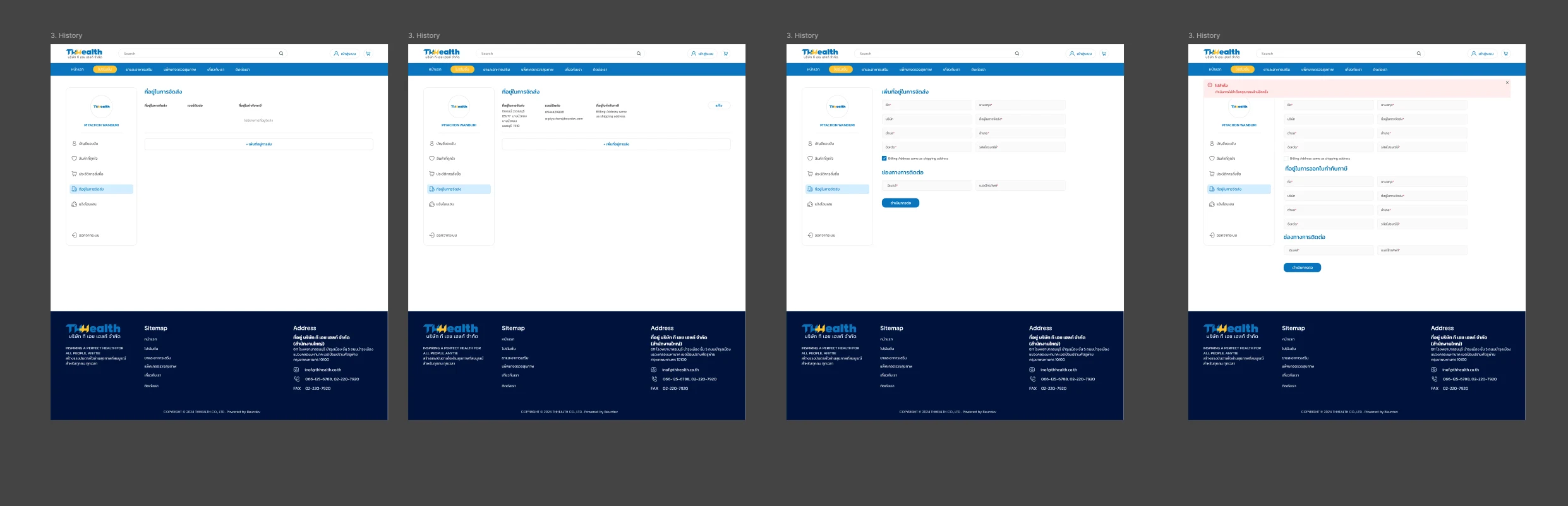
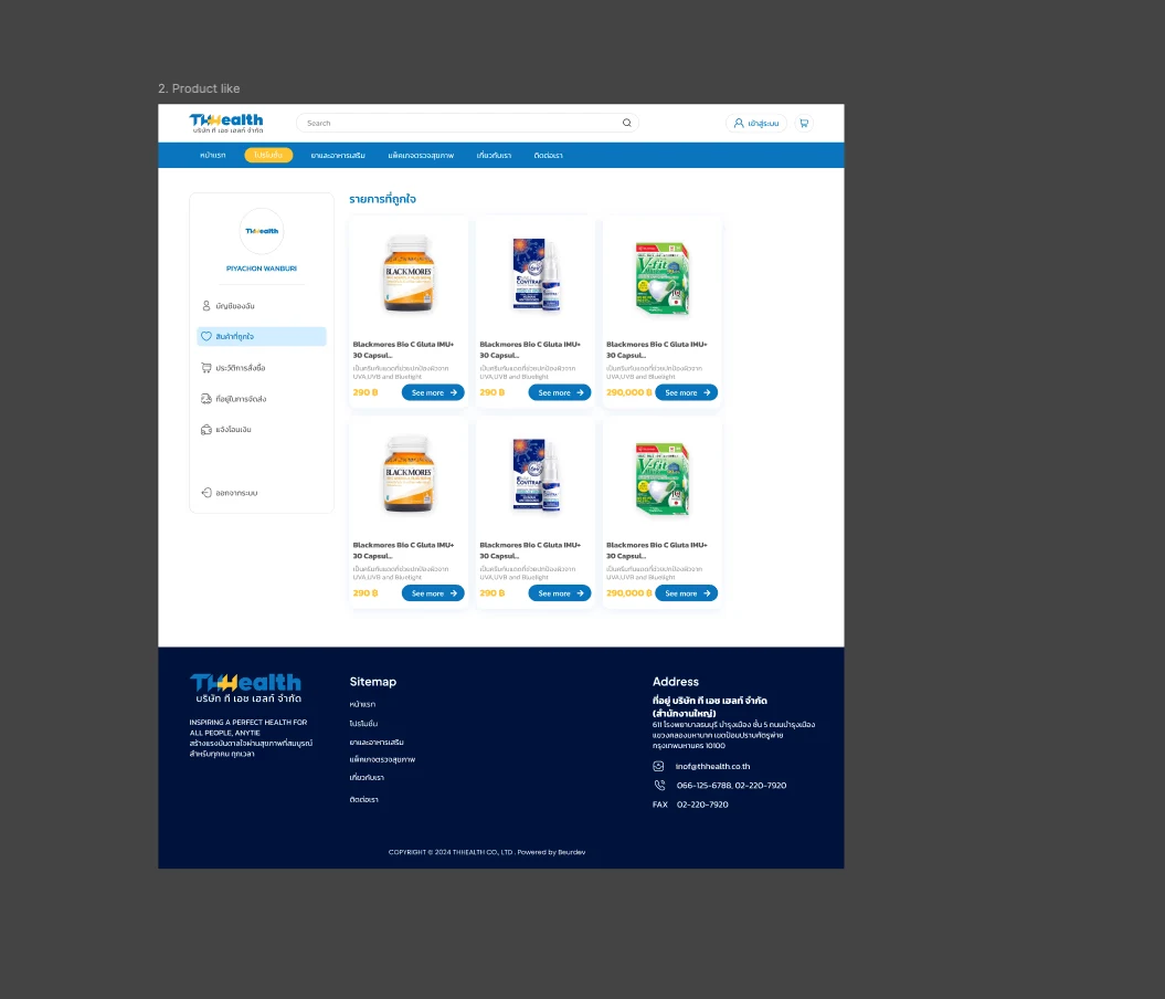
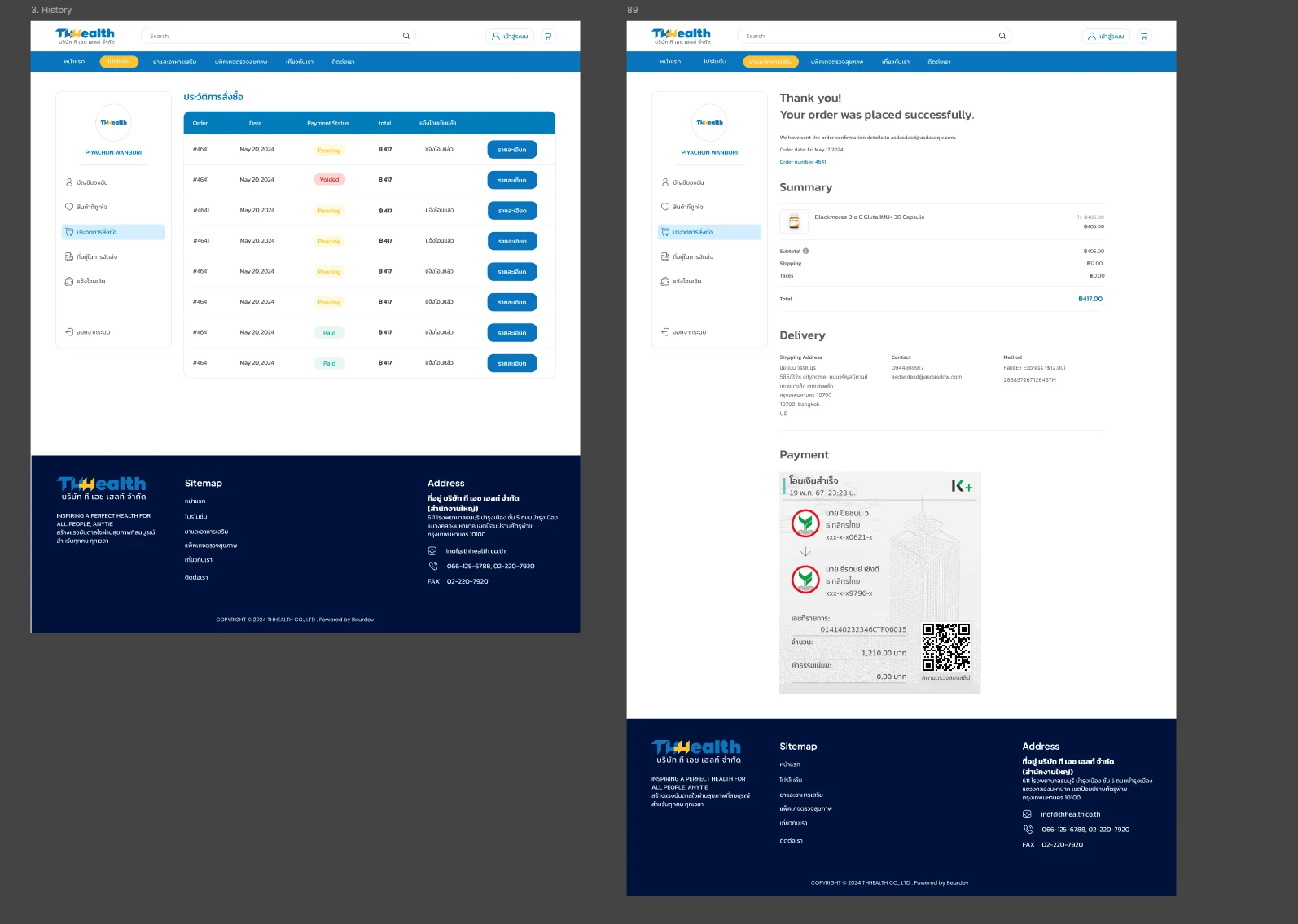
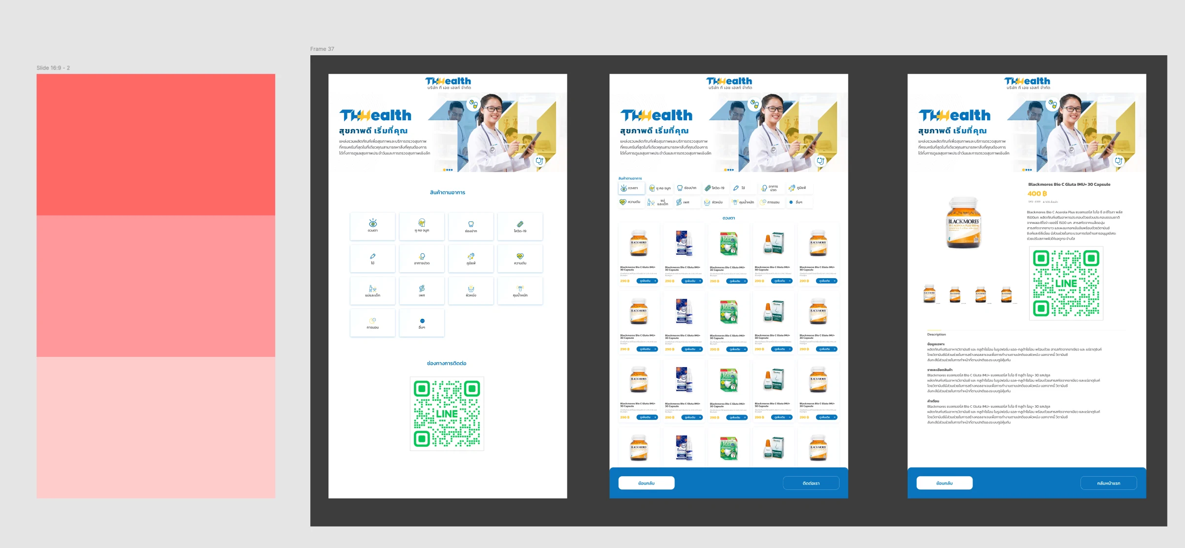
TH Health is an e-commerce platform for health products and check-up packages. The design gives customers several ways into the catalogue, starting from how they feel, takes them through a guided checkout and bank transfer flow, and carries the same symptom-first entry onto in-store kiosk screens.
Problem & Baseline
Customers looking for health products often know how they feel rather than the name of the product that helps. A catalogue organised only by category or brand asks them to know what to search for before they can find it. The platform also needed a purchase flow built around bank transfer, where the customer still has steps to complete after checkout, and a way to present health check-up packages, which are compared rather than browsed.
Key Design Decisions
Outcomes
| Area | Before | After | Outcome |
|---|---|---|---|
| Product discovery | Finding a product depended on knowing its name or category | Symptom, lifestyle and age-group entry points sit alongside category, brand and search | More ways in |
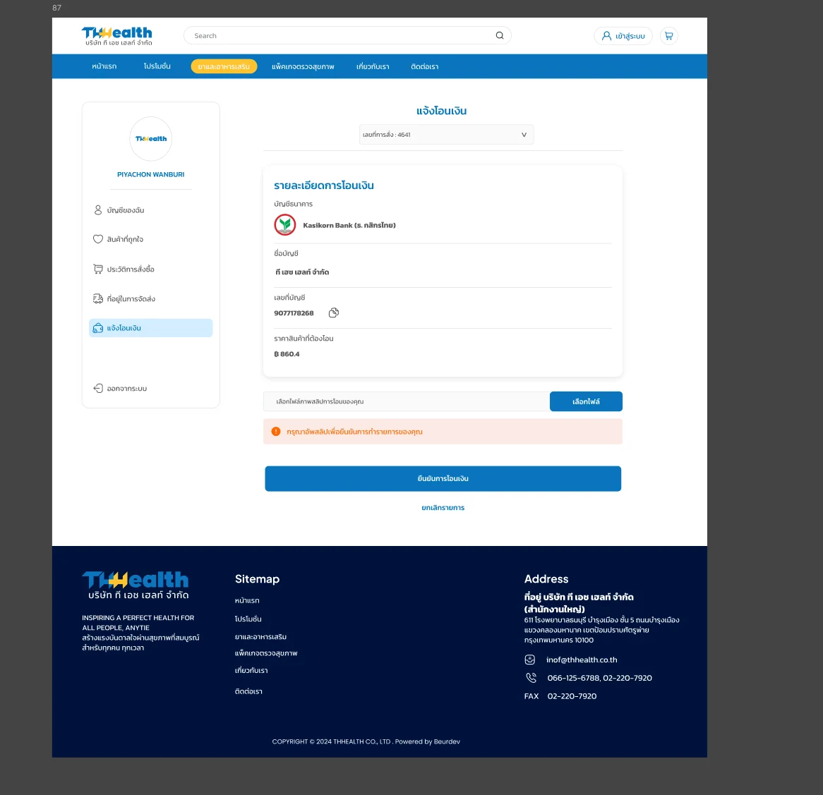
| Checkout & payment | Bank transfer left steps to complete after the order | Checkout and transfer designed as guided steps with slip upload | More guided |
| Order tracking | Customers needed a way to check payment and order status | Order history shows a payment status for every order | Easier to follow |
| Check-up packages | Packages differ in what they include | Inclusions compared in one table | Easier to compare |
| In-store kiosk | Kiosk screens needed their own entry point | Kiosk starts from the same symptom grid as the website | More consistent |
What I Learned
Customers describe health needs by how they feel, so offering several entry points, symptom alongside category and brand, served people with very different levels of product knowledge.
A bank transfer purchase does not end at checkout. Designing the slip upload, its error state and the payment status as part of the flow mattered as much as the checkout itself.
Carrying the symptom-first entry from the website onto kiosk screens showed the value of a shared structure across touchpoints, even when each screen format is different.