Thanada Construction Website
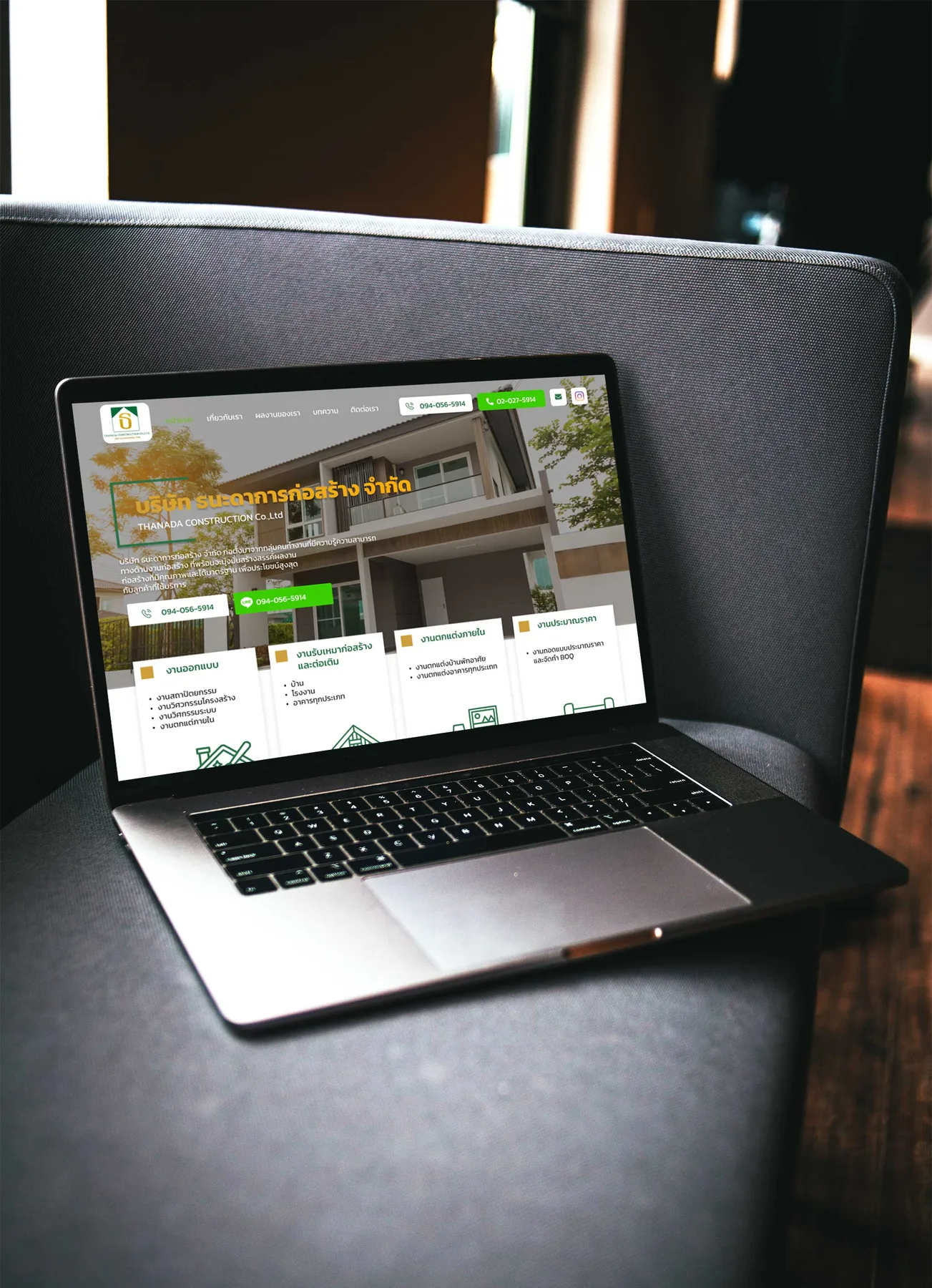
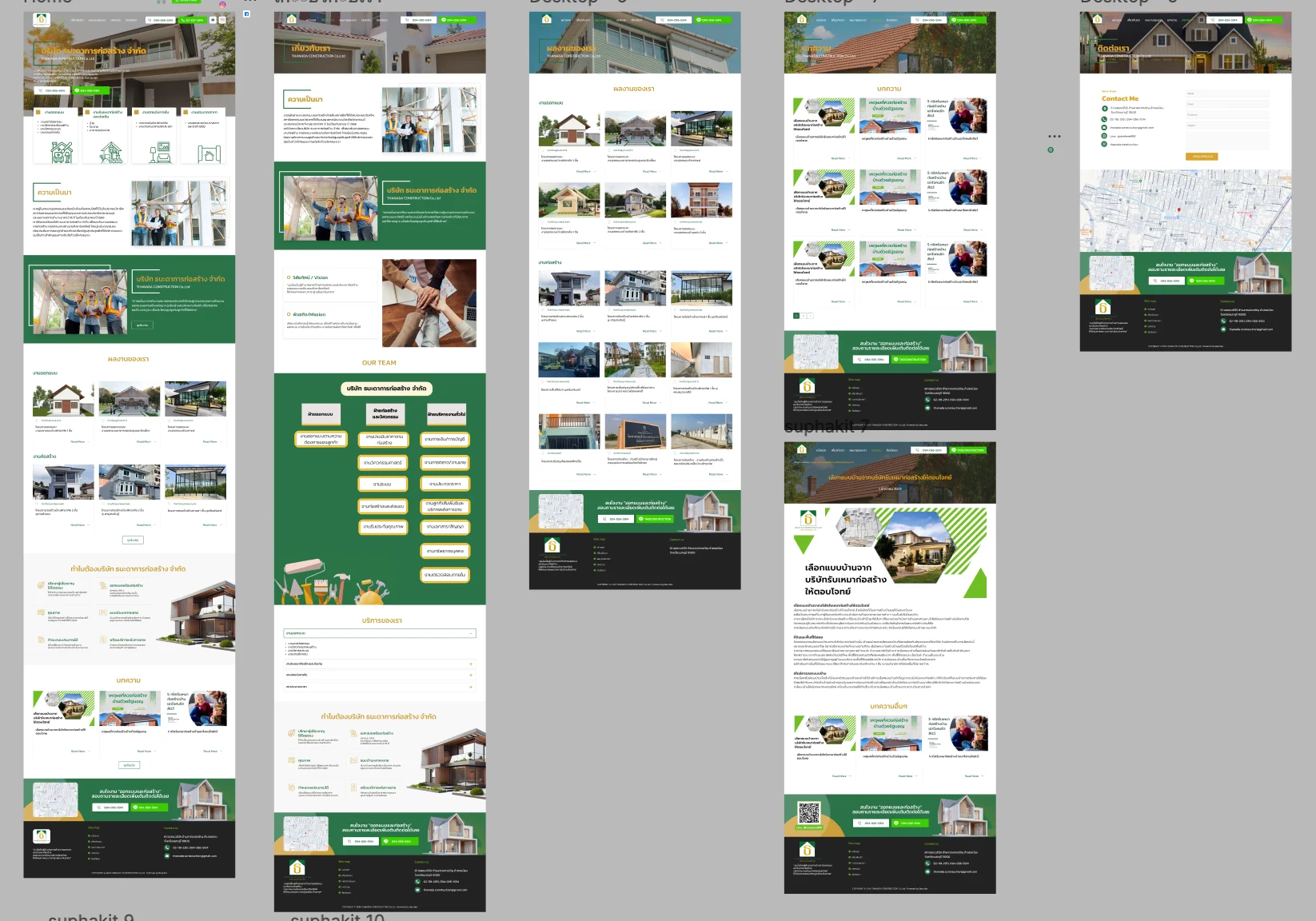
A portfolio and enquiry site for a residential design-and-build contractor, designed for a homeowner making a decision that takes months. The design separates the two judgements they make, shows who inside the company owns each stage, and stays useful to people who are not ready to enquire yet.
Problem & Usability Gaps
Commissioning a house is decided on evidence a homeowner cannot easily get. Read against the heuristics, a single gallery mixes two different judgements, taste in design and quality of construction; a builder's site rarely shows which people inside the company handle each stage, including who answers after handover; and someone researching months before they can commission has no reason to visit.
Design Decisions by Heuristic
Before & After by Heuristic
| Heuristic | Before | After | Change |
|---|---|---|---|
| Real-world | Design and construction mixed | Two portfolios judged separately | Separated |
| Visibility | Company structure unstated | Three departments, thirteen functions | Published |
| Guidance | No reason to visit early | Article and guide content | Reached |
| Efficiency | Contact on its own page | Phone and LINE band on every page | Closer |
"The question underneath 'which builder should I use' is usually 'will anyone answer when something needs fixing in year two'. Showing who owns each stage answers it better than a guarantee written in marketing copy."
— Design rationale · Thanada Construction WebsiteDesign Learnings
Separating two judgements the user makes in real life, taste and execution, makes each of them easier to make.
An organisation chart works as system status for a service: it turns a claim about capability into a visible list of who does what.
Long decisions need help content for people who cannot act yet; it is part of the job, not an extra.