Senior UX/UI DesignerResponsive Marketing WebsiteServiced Offices / Business Services

The Right Office

BEURDEV CO., LTD. · May 2024 – Jul 2024
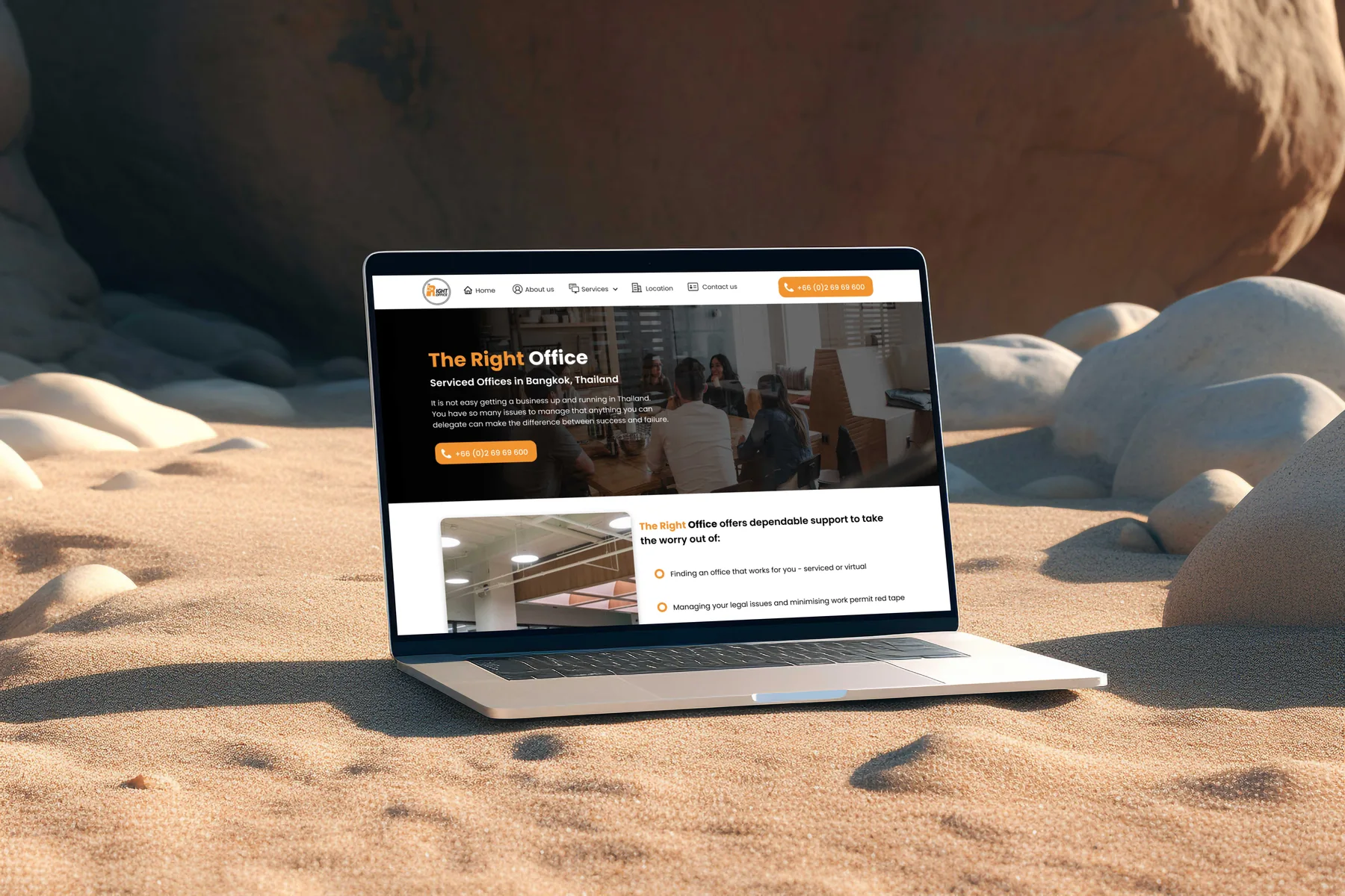
The Right Office website rebuild — serviced office, visa advisory, accounting and incorporation services for foreign businesses in Bangkok
Executive Summary & Impact
Recognition
Recognition rather than recall
six services shown as cards, not as menu labels
Consistency
Consistency and standards
six services on one card pattern, read as one set
Minimalism
Aesthetic and minimalist design
a long inclusions list kept in full and given structure

A rebuild of a business-services provider's site, from a fixed-width layout into a full-width one organised around six services and the one visitor they share. The design shows all six as one set of cards, opens the office cards with the visitor's own questions, and keeps a long list of inclusions in full while making it scannable. Each decision below is tied to the usability heuristic it serves.

01 / Discovery & Heuristic Gaps

Problem & Usability Gaps

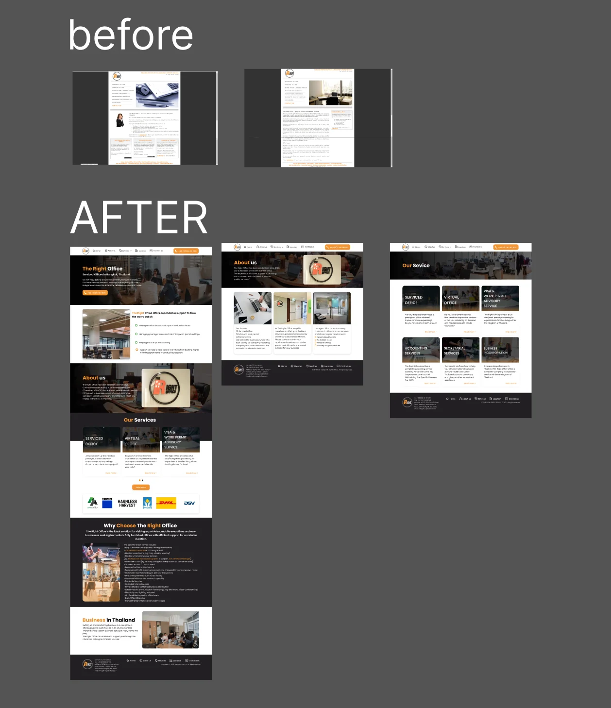
The site being replaced was built for a desktop monitor: a fixed-width column with small body text. Read against the heuristics, the six services appeared only as text links in a side menu, so a visitor had to know which label fitted their situation before learning anything about it; the home page itself was a column of prose; and the most useful content on the site, the list of what an office includes, sat in a small box at the foot of the page.

Menu labels only
six services listed as text links, with nothing about each
Fixed width
a narrow desktop column with small body text
Boxed away
the inclusions list squeezed into a small box at the foot of the page
02 / Architecture & UX System

Design Decisions by Heuristic

01
Recognition rather than recall
Six Services Shown, Not Listed
The services move out of the side menu and onto the home and services pages as six cards, each with a photograph, the service name, a short summary and a link to read more. A visitor recognises the one that fits instead of guessing from a menu label.
02
Consistency and standards
One Card Pattern for Every Service
Office, virtual office, visa and work permit advice, accounting, secretarial work and incorporation share one card structure. The six read as a single set, so a visitor who needs several of them sees that one provider covers them all.
03
Match between system and the real world
Office Cards Open With the Visitor's Question
The serviced and virtual office cards open with the questions a visitor would ask: a start-up needing a prestigious address, a company expanding, a short-term project, a small business whose owner is always on the road. The accounting card names the taxes it covers, from personal and corporate income tax to VAT and withholding tax, in the terms a business owner already uses.
04
Aesthetic and minimalist design
The Inclusions List, Structured Rather Than Cut
The list of what an office includes was kept in full and moved into its own section, Why Choose The Right Office, with a heading, a short introduction and the list beside photographs of the space. It was the content visitors needed most, so the fix for a cramped box was space and structure, not removal.
03 / Verification & Evidence

Before & After by Heuristic

HeuristicBeforeAfterChange
RecognitionServices as menu linksSix cards with photo and summaryVisible
ConsistencySide menu above a column of proseOne card pattern for all sixUnified
Real-worldThe provider's own descriptionOffice cards open with the visitor's questionsRelatable
MinimalismSmall box at the foot of the pageOwn section, kept in fullScannable

"The six services look unrelated until you notice they are the same visitor in the same month. Showing them as one set of cards is what lets a single visit cover all of them."

— Design rationale · The Right Office
04 / Retrospective

Design Learnings

→

Opening a card with the question it answers lets a visitor self-select faster than a description of the service; it works best where the questions are easy to state, as they were for the office cards.

→

A dense list is not automatically something to delete; when it is the content people need, the minimalist fix is structure rather than removal.

→

When several services share one customer, a shared card pattern tells the visitor they belong together more clearly than copy saying so.