Unionchemical Website

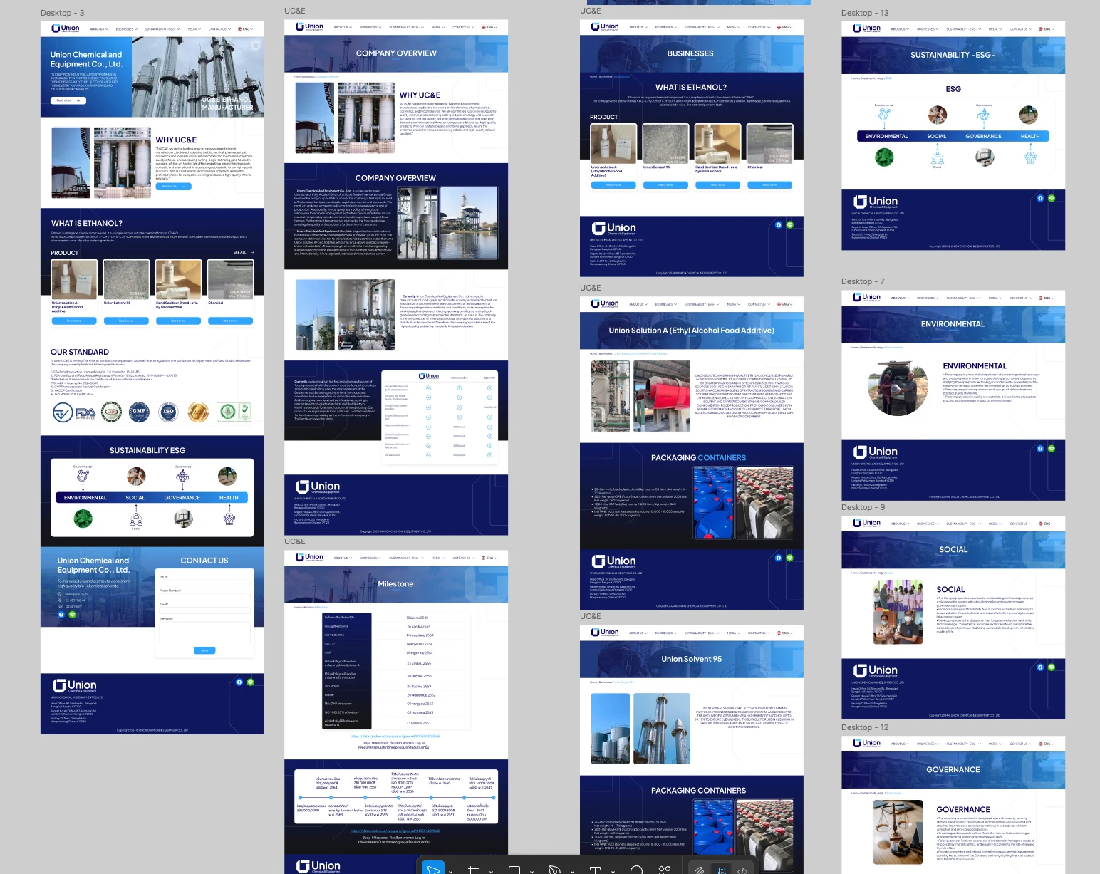
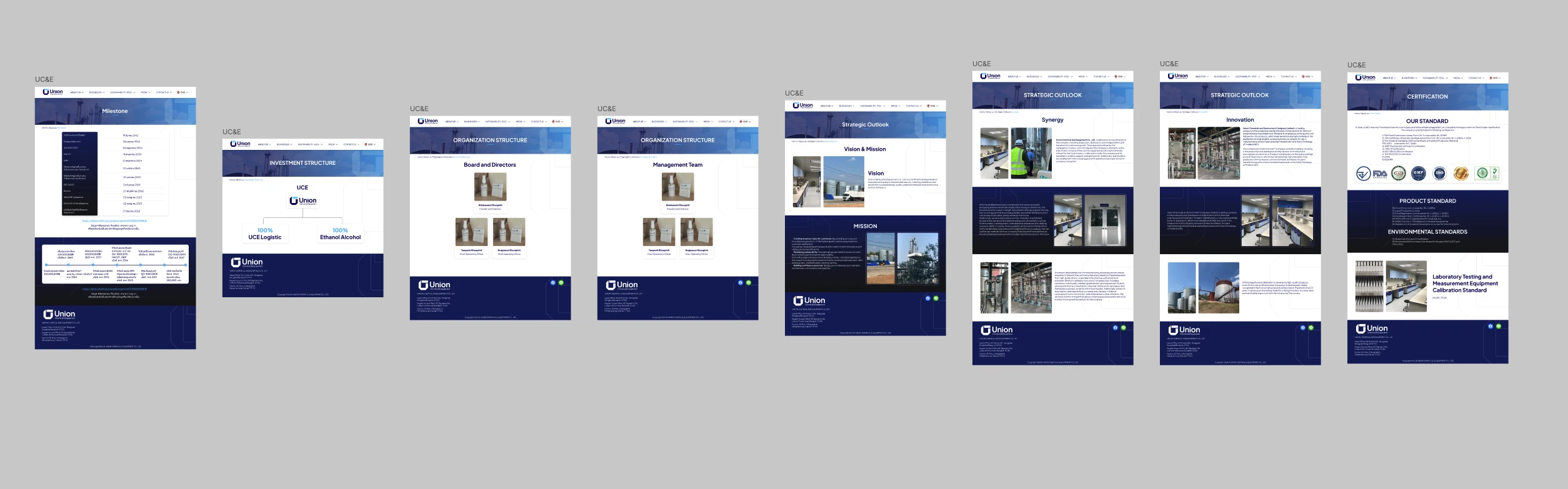
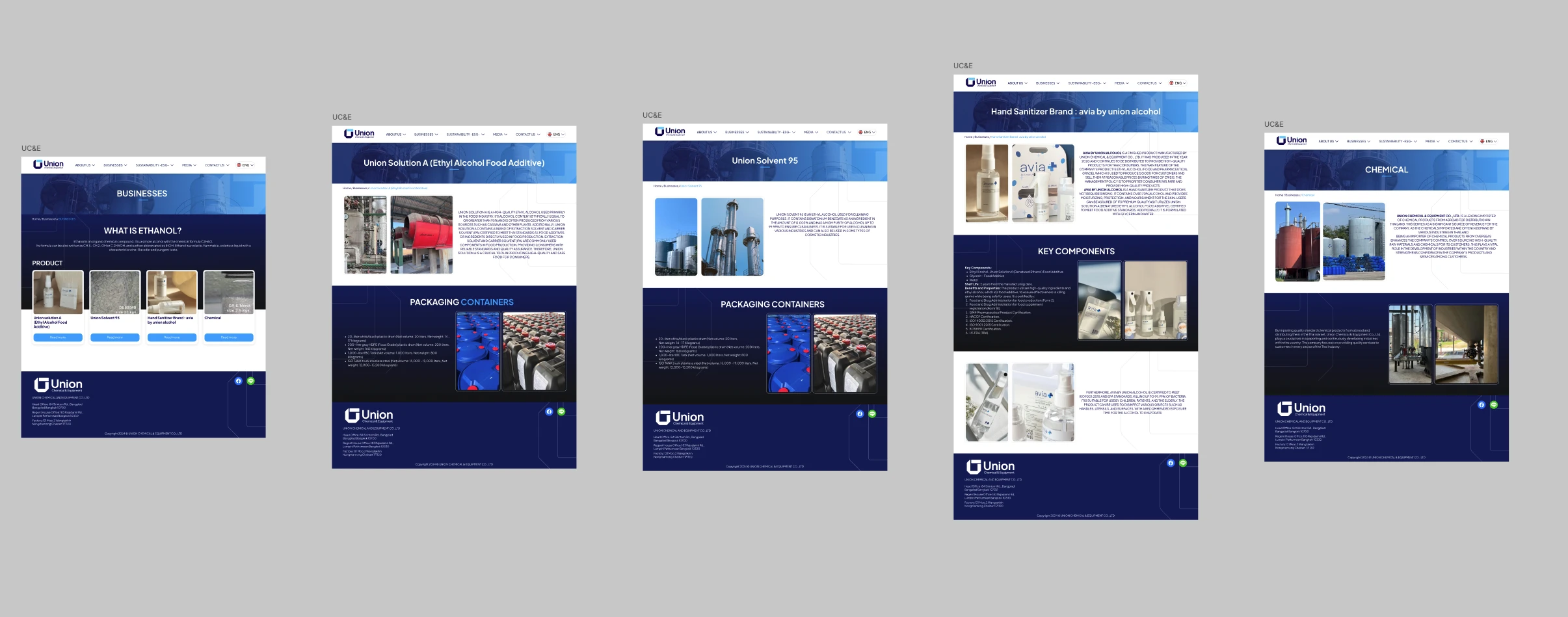
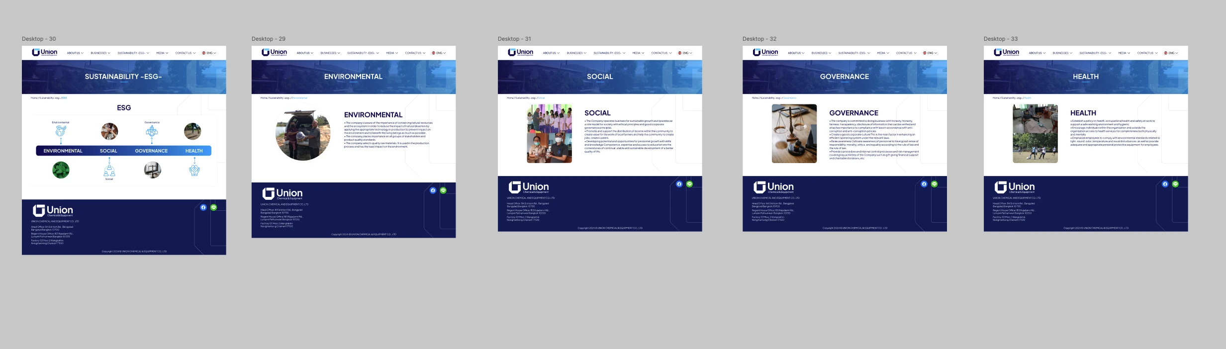
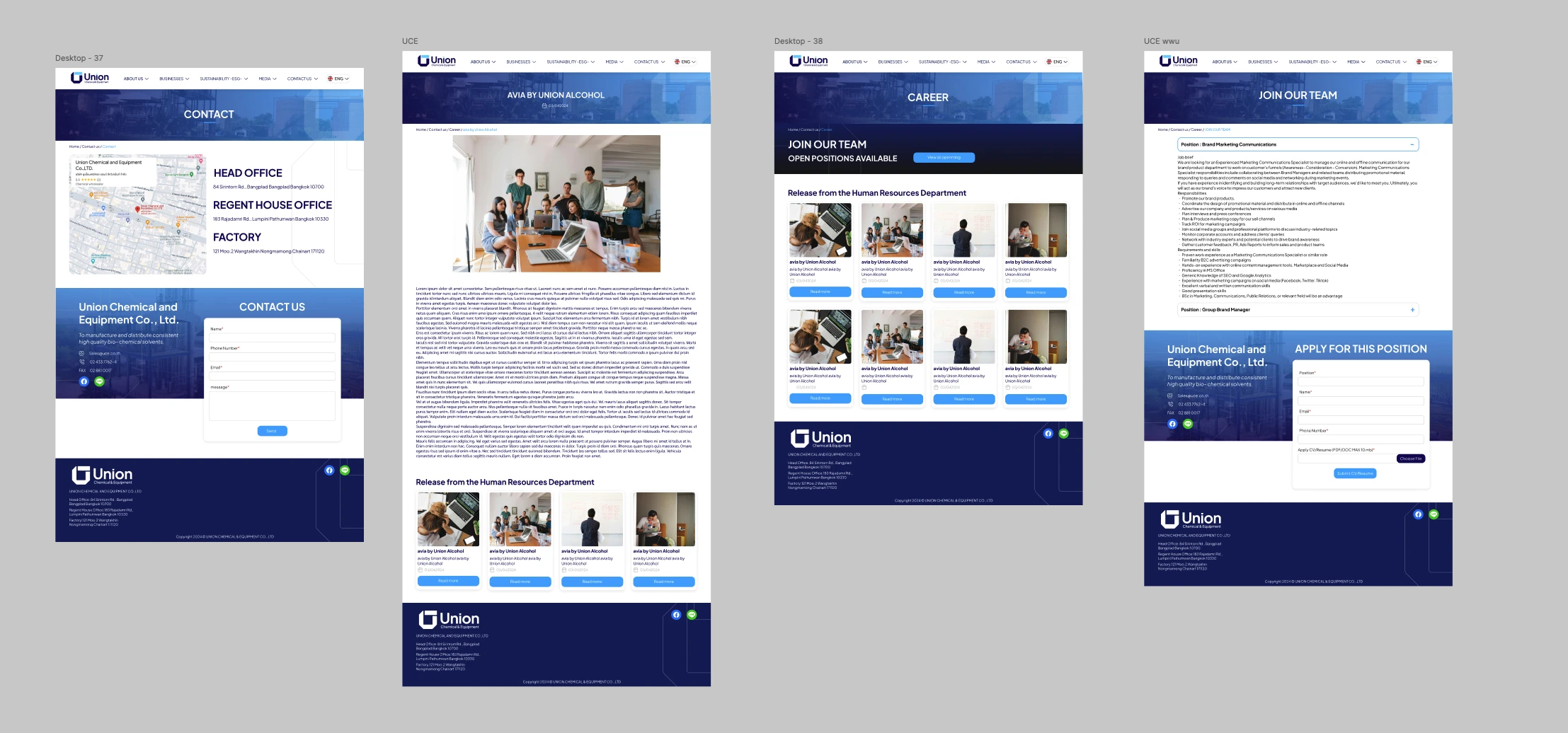
A corporate site for a manufacturer selling into regulated food and pharmaceutical supply chains, where the buyer audits before they buy. The design writes out the evidence a reviewer checks by name and number, shows the same history in two shapes for two kinds of reader, and puts the details that decide a purchase on the product page.
Problem & Usability Gaps
In a regulated supply chain, a procurement or quality reviewer screens a supplier against a checklist before a grade is discussed. Read against the heuristics, a conventional product site serves that reviewer badly: certification is reduced to a row of logos in the footer, with nothing a checklist item can be matched against; the company's history comes in one shape when two readers want different things from it; and shipping details are left for a later conversation, though they decide whether a product can be bought at all.
Design Decisions by Heuristic
Before & After by Heuristic
| Heuristic | Before | After | Change |
|---|---|---|---|
| Real-world | Marks as a footer row | Named standards and a four-group page | Checkable |
| Efficiency | History in one format | Dated table and timeline | Two views |
| Recognition | Shipping units on request | Specified on both ethanol product pages | In view |
| Minimalism | Every job description in full | Accordion with a CV upload | Collapsed |
"In a regulated supply chain the sale opens with an audit, not a pitch. Giving the evidence a reviewer checks its own place, written out by name and number, was the central design decision."
— Design rationale · Unionchemical WebsiteDesign Learnings
A reviewer matches a supplier against a checklist, so standards listed by name and licence number serve them better than a row of logos can.
The same content can serve two readers if it is given two shapes; showing the history twice was correct rather than redundant.
Details that decide whether a purchase is possible belong where the purchase is considered, not in a follow-up.