Senior UX/UI DesignerSix-Page Corporate SiteAccounting & Back Office Outsourcing

Zea Management Website
BEURDEV CO., LTD. · Jul 2024 – Oct 2024
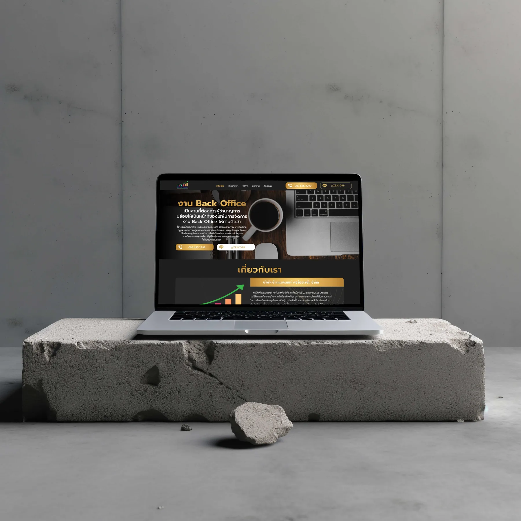
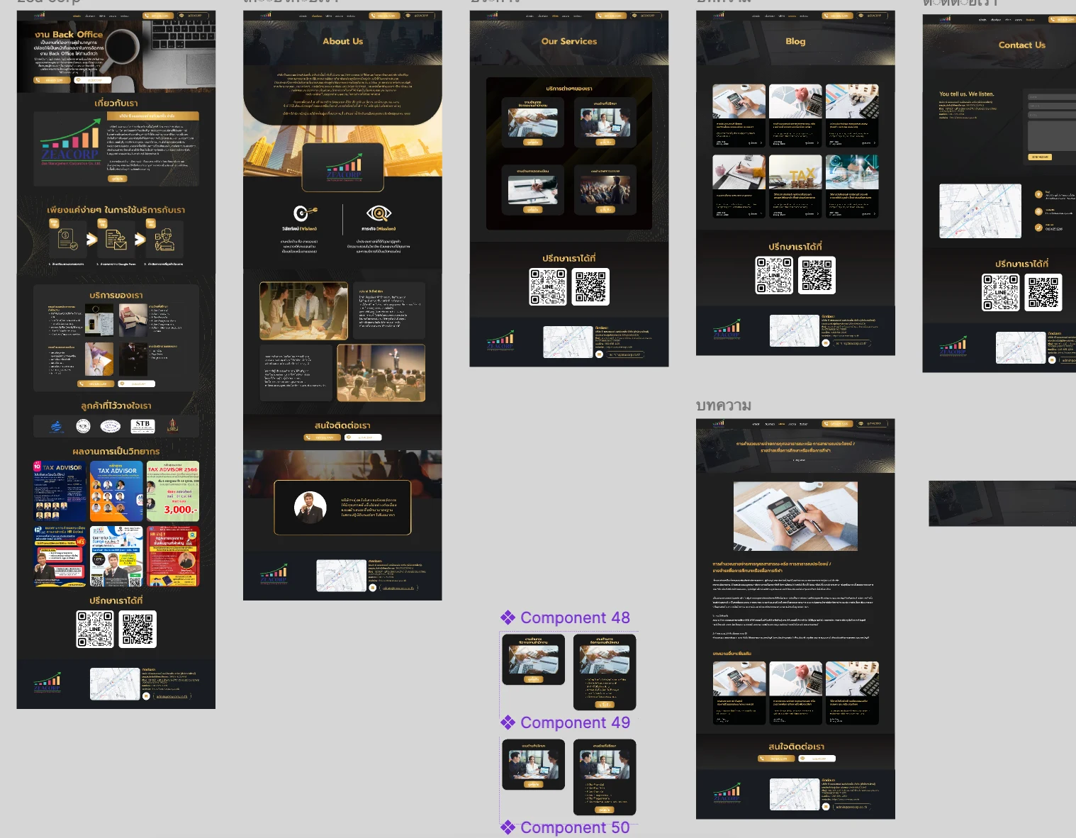
Zea Management website — black and gold identity, four service lines, client seals and a wall of seminar posters
Executive Summary & Impact
Visibility
Visibility of system status
three numbered steps show where an engagement starts
Real-world
Match between system and the real world
expertise shown through published course material
Consistency
Consistency and standards
reusable cards and one closing block across the pages

A six-page site for an accounting and business-services firm, designed for a visitor deciding whether to hand their financial records to someone they have not met. The design work went into three things: making the first step visible, showing expertise rather than describing it, and keeping every page on one set of components.

01 / Discovery & Heuristic Gaps

Problem & Usability Gaps

Outsourcing accounts is a high-trust decision made by someone who cannot easily judge accounting expertise. Read against the heuristics, the risks were specific: a visitor could not see what starting an engagement involved, so the first step felt like a commitment; expertise written as prose gave them nothing from their own world to check it against; and four services in a flat list gave them no structure to recognise their own need by.

First step unseen
nothing showed what starting an engagement involved or asked for
Claims, not evidence
expertise described in prose that any firm could have written
Flat service list
four lines of work with no structure to recognise a need by
02 / Architecture & UX System

Design Decisions by Heuristic

01
Visibility of system status
The Engagement Path in Three Steps
Getting started is published as three numbered steps with icons: state what you need, fill in the online form, receive the consultation. Naming the form as the first step shows a visitor where the process begins and what it asks of them, before they commit to a call or a meeting.
02
Match between system and the real world
Expertise Shown as Published Course Material
The homepage shows the firm's seminar posters as they were actually published, with dates, venues and fees. A visitor judges them the way they judge any course in the real world, as something other people already signed up for, which is a check that a sentence about experience cannot offer.
03
Recognition rather than recall
Four Services, One Card Each
Accounting, advisory, registration and training each get a card with a photograph, a title and a list of what it covers. A visitor scans for their own need and recognises it, instead of reading a description of everything the firm does.
04
Consistency and standards
One Component Set Across Six Pages
The service cards were built as reusable components with collapsed and expanded variants, and a consultation block with two QR codes, LINE among them, closes the home, services, blog and contact pages in the same form. A visitor learns the layout once and finds the same element in the same place.
03 / Verification & Evidence

Before & After by Heuristic

HeuristicBeforeAfterChange
VisibilityFirst step of an engagement unstatedThree numbered steps, the form named firstShown
Real-worldExpertise described in prosePublished seminar material on the homepageEvidenced
RecognitionServices in a flat listFour cards with photograph and inclusionsScannable
ConsistencyNot systematisedCard components and one closing blockSystematised

"Outsourcing accounts is decided on trust by someone who cannot audit an accountant. The design kept to things a visitor can check for themselves: what the first step is, what the firm has already taught, and the same structure on every page."

— Design rationale · Zea Management Website
04 / Retrospective

Design Learnings

→

For a high-trust service the most useful thing to make visible is the first step; naming it as a form rather than a meeting lowers the commitment a visitor believes they are making.

→

Evidence from the visitor's own world, such as a published course with a date and a fee, matches how people already judge expertise, which is why it carries further than a claim in prose.

→

Building the service cards as components with variants kept the pages consistent, so a new service reuses a pattern visitors have already learned.